Tag: YAML Automation

  • Capturing Min / Max Weather values in a Home Assistant Entity

    Tracking daily weather extremes in Home Assistant can be a really useful addition to your dashboard, especially if you’re keen to understand trends over time or highlight key information visually.

    Screenshot 2025-09-01 at 11.29.31

    In my case, I wanted a lightweight, efficient way to display the maximum temperature, minimum temperature, and maximum wind speed recorded during the day. Not only does this create a simple historical snapshot, but it also enables me to power Mushroom Template Cards with rich attribute data, without needing to rely on external integrations or long-term statistics.

    The Template Sensor

    Here’s the YAML I used to create a template sensor that records today’s key weather stats. This sensor uses a combination of state and time-based triggers to reset at midnight and accumulate data throughout the day.

    - trigger:
        - platform: state
          entity_id: 
            - sensor.tempest_temperature
            - sensor.tempest_wind_speed
        - platform: time
          at: "00:00:00"
      sensor:
        - name: 'Today Weather Statistics'
          unique_id: today_weather_statistics
          state: "OK"
          attributes:
            max_temp: >
              {% set t_new = states('sensor.tempest_temperature') | float(-99) %}
              {% set prev = this.attributes.max_temp | float(-99) %}
              {{ [t_new, prev] | max if trigger.platform != 'time' else t_new }}
            min_temp: >
              {% set t_new = states('sensor.tempest_temperature') | float(99) %}
              {% set prev = this.attributes.min_temp | float(99) %}
              {{ [t_new, prev] | min if trigger.platform != 'time' else t_new }}
            max_wind: >
              {% set w_new = states('sensor.tempest_wind_speed') | float(-1) %}
              {% set prev = this.attributes.max_wind | float(-1) %}
              {{ [w_new, prev] | max if trigger.platform != 'time' else w_new }}

    How it works

    • State triggers respond to changes in sensor.tempest_temperature and sensor.tempest_wind_speed. Every time they update, the template checks if the new value exceeds (or undercuts) the previous attribute value and stores the result.
    • Midnight reset is achieved via a time-based trigger at 00:00:00. At this point, the values reset to the current readings (effectively seeding the day).
    • The state is set to "OK" as a placeholder—it’s not used for charting or display, but helps avoid null states.

    Home Assistant issues with adding new attributes

    I found (randomly it seems not predictably) that some of the new attributes would not be created on their first load, once I restarted Home Assistant. It was very frustrating to debug, the logic is to set a variable from a entity state, or otherwise set a float – but something is failing. If you too are finding that the attribute isnt appearing, instead – establish the attribute more simply with a default value. Restart HA and confirm the attribute now shows up. E.g.

            max_wind: >
              {{ float(0) }}

    This creates the new max_wind attribute with a default value of 0.0. Now update your YAML per the above with the logic to capture the maximum wind speed, this time it should update without issue.

    Using This Sensor in Mushroom Cards

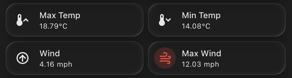
    Now that the max and min values are stored in the attributes, you can easily access them in mushroom-template-card components. Here’s an example that shows the max temperature for today:

    - type: custom:mushroom-template-card
      primary: "Max Temp"
      secondary: >
        {{ state_attr('sensor.today_weather_statistics', 'max_temp') | round(1) }}°C
      icon: mdi:thermometer-high

    Or for minimum temperature:

    - type: custom:mushroom-template-card
      primary: "Min Temp"
      secondary: >
        {{ state_attr('sensor.today_weather_statistics', 'min_temp') | round(1) }}°C
      icon: mdi:thermometer-low

    And similarly for wind:

    - type: custom:mushroom-template-card
      primary: "Max Wind"
      secondary: >
        {{ state_attr('sensor.today_weather_statistics', 'max_wind') | round(1) }} mph
      icon: mdi:weather-windy

    Why I Like This Approach

    • It’s simple and fast. No need to use mulitple sensors or long-term statistics.
    • It works entirely in real-time, using native templating.
    • It powers lightweight dashboard cards with just the information I want to see.
    • It’s resettable and predictable – every day starts clean at midnight.
  • Building a Hourly Rain Forecast Chart in Home Assistant

    I’ve been playing around with ways to better visualise upcoming rainfall. The main weather integrations in Home Assistant often focus on current conditions or broad daily forecasts, but I wanted something more granular.

    Chart showing hourly rainfall

    Specifically, I wanted to see hourly rainfall predictions for the next 24 hours in a compact, clean, and useful format. Ideal for deciding if I need to bring the washing in or delay watering the garden. Here’s how I set it up.

    Step 1: Create the Input Text Helper (YAML)

    First, we need a place to store the hourly rainfall values. I created a simple input_text helper in configuration.yaml. This holds a JSON string that we can read later in the chart.

    Here’s the code to add:

    input_text:
      hourly_forecast_json:
        name: Hourly Forecast JSON
        initial: ""
        max: 255

    Note: The default limit is 255 characters, which fits roughly 24 hourly values. If you want to expand this for a longer range, you can increase the max value — for example, set max: 1024 for future-proofing.

    Once added, restart Home Assistant to activate the helper.

    Step 2: Pull the Hourly Forecast Data

    Next, I created an automation that fetches the next 24 hours of hourly weather data from my forecast provider. It extracts just the precipitation values and stores them as a JSON array in the helper.

    This runs every 5 minutes to keep the data fresh:

    alias: Update Hourly Forecast
    description: ""
    trigger:
      - platform: time_pattern
        minutes: "/5"
    action:
      - service: weather.get_forecasts
        data:
          type: hourly
        target:
          entity_id: weather.my_forecast_provider
        response_variable: forecast_data
    
      - service: input_text.set_value
        data:
          entity_id: input_text.hourly_forecast_json
          value: >
            {{
              forecast_data['weather.my_forecast_provider'].forecast[:24]
              | map(attribute='precipitation')
              | list
              | to_json
            }}
    mode: single

    This gives you a neat string like [0.0, 0.2, 0.4, 0.0, ...] representing each hour’s predicted rainfall in millimetres.

    Step 3: Display the Chart with ApexCharts

    I wanted the final chart to be small, clean, and focused. Using apexcharts-card, I built a column chart that only shows hours where rain is expected — zeroes are filtered out to reduce clutter.

    Here’s the YAML for the card:

    - type: custom:apexcharts-card
      header:
        title: 24h Precipitation Forecast
        show: true
      graph_span: 24h
      span:
        start: hour
      yaxis:
        - min: 0
          decimals: 2
      series:
        - entity: sun.sun  # dummy entity to enable chart
          name: Rain (mm)
          type: column
          color: rgb(76, 166, 238)
          data_generator: |
            try {
              const raw = hass.states['input_text.hourly_forecast_json']?.state;
              if (!raw || !raw.startsWith("[")) return [];
              const data = JSON.parse(raw);
              if (!Array.isArray(data)) return [];
              const now = new Date();
              now.setMinutes(0, 0, 0);  // align to hour start
              return data.reduce((acc, val, i) => {
                if (val !== 0) {
                  const time = new Date(now.getTime() + i * 3600 * 1000).getTime();
                  acc.push([time, val]);
                }
                return acc;
              }, []);
            } catch (e) {
              console.error("ApexCharts data_generator error:", e);
              return [];
            }
      apex_config:
        chart:
          height: 200px
        tooltip:
          enabled: false
        plotOptions:
          bar:
            columnWidth: 14
            borderRadius: 1
        stroke:
          width: 1
          colors:
            - "#FFFFFF"
        dataLabels:
          offsetY: -10
          style:
            fontSize: 9
        xaxis:
          labels:
            hideOverlappingLabels: false
            rotate: 90
            show: true
            style:
              fontSize: 9
            format: HH
        yaxis:
          show: false
        legend:
          show: false

    This chart gives a very quick heads-up on upcoming rain intensity. Because it only shows hours with rain (zero values are filtered out), it’s minimal and takes up little space. It works well on both mobile and wall-mounted dashboards.

    More importantly, it pulls real hourly forecast data rather than estimates or summaries. You get the precise precipitation expected in millimetres for each hour. Handy if you’re deciding whether to pause a garden irrigation schedule or go out for a walk.