Tag: yaml

  • Generating a Beautiful Annual Solar PV Chart in Home Assistant

    This beautiful apexcharts chart gives me a clean annual view of solar PV performance month on month.

    chart showing annual solar pv generation month to month

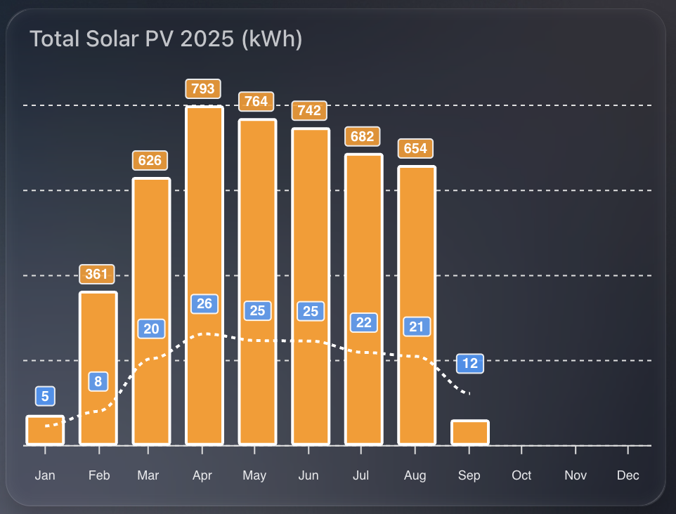
    I show two things at once:

    1. Total kWh per month as orange columns.
    2. Average daily PV for that month as a dashed line.

    That pairing makes it easy to compare seasonal variation and spot how consistent generation is within each month.


    1) The time window

    I want a rolling 12-month view, aligned to the current year start, updating every 30 minutes.

    graph_span: 12month
    update_interval: 30m
    span:
      start: year
      offset: "-0d"

    2) Monthly totals as columns

    I read SolarEdge lifetime energy, convert Wh to kWh, then sum by month. I also enable statistics so ApexCharts aligns changes to month boundaries for accurate month on month totals.

    - entity: sensor.solaredge_lifetime_energy
      name: PV Last 12 Months
      color: var(--energy-solar-color)
      type: column
      float_precision: 0
      yaxis_id: first
      transform: return x / 1000;
      show:
        datalabels: true
      group_by:
        func: sum
        duration: 1month
        fill: zero
      statistics:
        type: change
        period: month
        align: end

    Why:

    • transform converts Wh to kWh.
    • group_by: sum gives a single monthly bar.
    • statistics: period: month ensures the change is aligned to the end of each month.

    3) Average daily PV as a dashed line

    I reuse the same entity and conversion, but average across the month, with statistics aligned by day. This produces a smooth “average day in this month” figure.

    - entity: sensor.solaredge_lifetime_energy
      name: PV Last 12 Months
      type: line
      stroke_dash: 3
      float_precision: 0
      color: "#3399FF"
      yaxis_id: second
      transform: return x / 1000;
      show:
        datalabels: true
      group_by:
        func: avg
        duration: 1month
        fill: zero
      statistics:
        type: change
        period: day
        align: end
      extend_to: false

    Why:

    • group_by: avg over a month produces the per-month daily average.
    • statistics: period: day uses daily changes to derive a meaningful daily rate.
    • stroke_dash: 3 makes the line read as a secondary metric.

    4) Dual y-axes for tidy scales

    Totals and averages sit on different ranges, so I bind columns to the left axis and the line to the right axis. Both are hidden to keep the design clean.

    yaxis:
      - id: first
        decimals: 2
        show: false
        min: 0
      - id: second
        opposite: true
        decimals: 0
        min: 0
        max: 80
        show: false

    5) Bar styling and stroke

    I keep columns compact with a subtle corner radius, and give lines a clear white stroke outline for contrast on dark themes.

    apex_config:
      plotOptions:
        bar:
          columnWidth: 28
          borderRadius: 1
      stroke:
        width: 2
        colors:
          - "#FFFFFF"

    6) Data labels with a custom formatter

    The line’s labels always show. Column labels only show for useful values, which keeps winter months uncluttered.

    apex_config:
      dataLabels:
        offsetY: -10
        style:
          fontSize: 10
        formatter: |
          EVAL: function(value, {seriesIndex, dataPointIndex, w }) {
            const roundedValue = Number(value).toFixed(0);
            if (seriesIndex === 1) {
              return roundedValue;
            }
            return roundedValue < 100 ? '' : roundedValue;
          }

    Why:

    • When seriesIndex === 1 (the dashed line), always show the rounded value.
    • For the column series, hide values below 100 kWh to avoid visual noise.

    7) Minimal legend and tooltip

    This is a glanceable tile, so I remove the legend and tooltips.

    apex_config:
      legend:
        show: false
      tooltip:
        enabled: false

    8) Month labels

    Three-letter month labels save space and remain readable.

    apex_config:
      xaxis:
        labels:
          hideOverlappingLabels: false
          rotate: 90
          show: true
          style:
            fontSize: 9
          format: MMM

    Full YAML

    type: custom:apexcharts-card
    graph_span: 12month
    update_interval: 30m
    span:
      start: year
      offset: "-0d"
    header:
      show: true
      title: Total Solar PV 2025 (kWh)
    series:
      - entity: sensor.solaredge_lifetime_energy
        name: PV Last 12 Months
        color: var(--energy-solar-color)
        type: column
        float_precision: 0
        yaxis_id: first
        transform: return x / 1000;
        show:
          datalabels: true
        group_by:
          func: sum
          duration: 1month
          fill: zero
        statistics:
          type: change
          period: month
          align: end
      - entity: sensor.solaredge_lifetime_energy
        name: PV Last 12 Months
        type: line
        stroke_dash: 3
        float_precision: 0
        color: "#3399FF"
        yaxis_id: second
        transform: return x / 1000;
        show:
          datalabels: true
        group_by:
          func: avg
          duration: 1month
          fill: zero
        statistics:
          type: change
          period: day
          align: end
        extend_to: false
    yaxis:
      - id: first
        decimals: 2
        show: false
        min: 0
      - id: second
        opposite: true
        decimals: 0
        min: 0
        max: 80
        show: false
    apex_config:
      chart:
        height: 300px
      legend:
        show: false
      plotOptions:
        bar:
          columnWidth: 28
          borderRadius: 1
      stroke:
        width: 2
        colors:
          - "#FFFFFF"
      tooltip:
        enabled: false
      dataLabels:
        offsetY: -10
        style:
          fontSize: 10
        formatter: |
          EVAL: function(value, {seriesIndex, dataPointIndex, w }) {
            const roundedValue = Number(value).toFixed(0);
            if (seriesIndex === 1) {
              return roundedValue;
            }
            return roundedValue < 100 ? '' : roundedValue;      
          }      
      xaxis:
        labels:
          hideOverlappingLabels: false
          rotate: 90
          show: true
          style:
            fontSize: 9
          format: MMM
  • Template Sensor and Attribute issues in Home Assistant

    I came across an interesting issue today and thought it worth documenting.

    I have setup a template sensor which is triggered by the state change of an entity. This template sensor saves a generic state (a string saying OK), storing a maximum or minimum value of the referenced entity as an attribute. Its a daily maximum, so I reset it at midnight.

    Screenshot 2025-09-04 at 13.40.11

    Template Sensor Setup

    In order to calculate if for example the "new" state of the entity was higher than the previous maximum value stored in the attribute, I have this logic in the template sensor YAML:

    attributes:
        max_rain: >
            {% set r_new = states('sensor.tempest_precipitation_intensity') | float(-1) %}
            {% set prev = this.attributes.max_rain | float(-1) %}
            {{ [r_new, prev] | max if trigger.platform != 'time' else r_new }} 

    So, create a variable r_new of the current state of the precipitation intensity entity, otherwise return -1.

    Next, set a variable prev to get the previous value of the current template sensor attribute (max_rain), otherwise return -1.

    Finally set the max_rain attribute to the largest of the two variables (r_new or prev), or reset to the current state (r_new) at midnight.

    The Problem

    If you test out this YAML logic in the developer tools, it works without error. E.g.

    {% set r_new = states('sensor.tempest_precipitation_intensity') | float(-1) %}
    {% set prev = state_attr('sensor.today_weather_statistics', 'max_rain') | float(-1) %}
    {{ [r_new, prev] | max }}
    Screenshot 2025-09-04 at 13.27.27
    Screenshot 2025-09-04 at 13.27.35

    The result here is 0.0, which reflects the current state from sensor.tempest_precipitation_intensity. In this case prev is returning -1 because the attribute max_rain does not exist on sensor.today_weather_statistics. All expected so far.

    The REAL problem

    The issue comes in when we’re trying to create this template sensor for the first time and establish the max_rain attribute. Because the logic to create and update the max_rain attribute references itself, something internally seems to fail. This all happens despite the YAML being safe in the developer tools. E.g.

    {% set prev = state_attr('sensor.today_weather_statistics', 'max_rain') | float(-1) %}

    Returns -1 safely in the developer tools. But it seems this kind of reference to itself cannot work on the first initialisation of the attribute itself. What you’ll find is the attribute never appears in your template sensor.

    Solution

    So instead of creating the self referencing logic in the first place, the easiest thing to do is something like this, where you create the attribute and assign a default value:

    - trigger:
      - platform: state
        entity_id: 
            - sensor.tempest_precipitation_intensity
      - platform: time
        at: "00:00:00"
      sensor:
        - name: 'Today Weather Statistics'
          unique_id: today_weather_statistics
          state: "OK"
          attributes:
            max_rain: >
                {{ float(0.0) }}

    Restart Home Assistant, go check out your new sensor, and confirm the max_rain attribute appears, with a value of 0.0.

    Now you’re ready for the self-referencing logic to work and not fail. Go back to your template sensor YAML, and update the max_rain logic:

    - trigger:
      - platform: state
        entity_id: 
            - sensor.tempest_precipitation_intensity
      - platform: time
        at: "00:00:00"
      sensor:
        - name: 'Today Weather Statistics'
          unique_id: today_weather_statistics
          state: "OK"
          attributes:
            max_rain: >
                        {% set r_new = states('sensor.tempest_precipitation_intensity') | float(-1) %}
                        {% set prev = this.attributes.max_rain | float(-1) %}
                        {{ [r_new, prev] | max if trigger.platform != 'time' else r_new }} 

    Restart Home Assistant – this time you should still see your attribute, but most importantly, see the value increase from 0.0, should the state of your reference entity be higher.

  • Adding Weather Forecast to the Predbat Table Card in Home Assistant

    Predbat is brilliant at building smart charging and discharging plans for my home battery system, based on real-time energy costs, predicted house load, and solar forecasts. It uses Solcast data to predict generation and works out the best times to import, export, or hold energy.

    predbat table card weather columns

    But while Solcast takes weather into account when generating its solar forecast, I often found myself wondering why a particular slot was being scheduled a certain way. Was it cloudy? Raining? Very hot? All of these could affect either solar production or battery efficiency.

    That’s when I decided to bring weather information directly into the Predbat Table Card.

    Why Add Weather to the Table?

    Although Predbat itself does not use the weather entity directly, it’s still useful to overlay forecast conditions with the battery plan. This extra context helps me better understand why certain slots are heavy on import or export, especially when the solar forecast looks optimistic but the weather conditions are less than ideal.

    By seeing temperature, cloud cover, or rain in each 30-minute slot, I can cross-reference the charging plan with real-world weather, and make sense of some edge-case decisions.

    How the Integration Works

    The Predbat Table Card supports optional weather and temperature columns through two features I added:

    • weather-column: shows a weather icon for the slot
    • temp-column: shows the predicted temperature
    • rain-column: shows the predicted chance of rain

    To enable them, you need a valid forecast-capable weather entity in Home Assistant and to define it using weather_entity.

    Example Configuration

    Here’s how I set it up in my YAML:

    type: custom:predbat-table-card
    title: Predbat Plan with Weather
    weather_entity: weather.forecast_home
    columns:
      - time-column
      - weather-column
      - temp-column
        - rain-column
      - import-column
      - state-column

    You can of course rearrange or add more columns like export-column, load-column, or soc-column etc as needed.

    Notes on Forecast Compatibility

    This feature only works with forecast-style weather entities that follow the Home Assistant spec. Tested working examples include:

    • weather.met_home (from Met.no)
    • weather.weatherflow_forecast (from the WeatherFlow integration)
    • weather.met_office_yourlocation (from the Met Office weather integration)

    If the weather forecast does not cover the full duration of the Predbat plan (e.g. forecast ends before the plan does), then no weather icon or temperature will show for those slots.

    Colour-Coding and Hover Details

    To quickly spot critical conditions, the table applies colour coding:

    • Red: temperature over 25°C – which could reduce solar panel efficiency
    • Blue: temperature below 0°C – which could reduce battery efficiency

    Each icon also supports mouse-over tooltips, where you can view the detailed weather condition and temperature value.


    If you want to try this yourself, grab the latest version of Predbat Table Card and follow the weather column documentation.

  • Building a Min-Max-Avg Temperature Chart in Home Assistant

    This guide walks you through how I created a clean, monthly temperature overview card in Home Assistant, showing maximum, minimum, and average temperatures across the year – with a live annotation for the current reading.

    Chart showing monthly temperatures for my location

    The chart provides a fantastic visual snapshot of temperature trends throughout the year and uses the excellent apexcharts-card combined with config-template-card for dynamic annotations.


    Why I Built This

    I wanted a quick way to compare month-to-month temperatures for 2025 – not just the highs and lows, but also how the average temperatures trend over time. And with the real-time temperature annotated on the chart, it’s easy to see how the current conditions stack up against the year so far.


    What You’ll Need

    Before you start, make sure you have:

    • Home Assistant running with HACS
    • Installed the following custom cards via HACS:
    • A temperature sensor that reports regularly (e.g., sensor.tempest_temperature in my case)

    How Monthly Max, Min, and Average Temperatures Work

    The magic behind this chart lies in the use of Home Assistant’s built-in long-term statistics capability, which powers the statistics: feature of apexcharts-card.

    Each series uses the following:

    • type: max and type: min with period: month to extract monthly maximum and minimum temperatures respectively
    • type: mean along with group_by.func: avg to generate a monthly average line (in white)

    This means you’re not visualising raw sensor data points, but summarised monthly metrics – ideal for year-on-year comparisons or spotting unusual weather patterns.

    You can control how values are aggregated using align: start or align: end, which defines where in the month each value is anchored on the timeline.


    How the Live Annotation Works

    This chart includes a live annotation showing the current temperature as a small dot with a label.

    This is done using the annotations: section of ApexCharts, made dynamic by wrapping the entire card in a config-template-card.

    Here’s what happens:

    • We define datenow using JavaScript to get the timestamp for the first day of the current month
    • We read the current value from the sensor (sensor.tempest_temperature) using states[...]
    • We format that value to one decimal place and append the unit (°C)
    • These variables (${datenow}, ${temp}, ${tempString}) are injected into the chart’s annotations dynamically

    Without config-template-card, you couldn’t do this interpolation – it’s what allows us to reference JavaScript and Home Assistant state directly within the card definition.


    Customising the X-Axis Labels

    A small detail, but one that makes a big visual difference: the X-axis month labels are rotated and styled for clarity.

    xaxis:
      labels:
        rotate: 90
        style:
          fontSize: 9
        format: MMM

    This does three things:

    1. Rotates the labels so they don’t overlap
    2. Uses short month format (e.g. Jan, Feb, Mar) for a cleaner look
    3. Applies smaller font size to avoid clutter

    This is particularly useful when plotting an entire year, where 12 data points can otherwise get cramped.


    YAML Configuration

    Below is the full YAML you can drop into your dashboard. I used sensor.tempest_temperature as the data source, but you can replace it with any temperature sensor you have.

    type: custom:config-template-card
    variables:
      datenow: new Date(new Date().getFullYear(), new Date().getMonth(), 1).getTime()
      temp: parseFloat(states["sensor.tempest_temperature"].state)
      tempString: >-
        parseFloat(states["sensor.tempest_temperature"].state).toFixed(1) +
        states["sensor.tempest_temperature"].attributes.unit_of_measurement
    entities:
      - sensor.tempest_temperature
    card:
      type: custom:apexcharts-card
      update_interval: 30m
      graph_span: 11month
      span:
        start: year
      header:
        show: true
        title: Max|Min Temps 2025 (°C)
      now:
        show: false
      series:
        - entity: sensor.tempest_temperature
          name: Max Temp
          type: area
          color: "#e63946"
          opacity: 0.3
          float_precision: 1
          show:
            datalabels: true
          statistics:
            type: max
            period: month
            align: start
          extend_to: false
    
        - entity: sensor.tempest_temperature
          name: Min Temp
          type: area
          color: "#457b9d"
          opacity: 0.3
          float_precision: 1
          show:
            datalabels: true
          statistics:
            type: min
            period: month
            align: start
          extend_to: false
    
        - entity: sensor.tempest_temperature
          name: Avg Temp
          type: line
          color: "#ffffff"
          stroke_dash: 3
          float_precision: 1
          opacity: 0.8
          show:
            datalabels: false
          group_by:
            func: avg
            duration: 1month
            fill: zero
          statistics:
            type: mean
            period: month
            align: end
          extend_to: false
    
      apex_config:
        chart:
          height: 200px
        legend:
          show: false
        tooltip:
          enabled: false
        stroke:
          width: 2
        dataLabels:
          offsetY: -5
          style:
            fontSize: 9px
          formatter: |
            EVAL:function(val, opts) {
              return val.toFixed(1) + "°C";
            }
        xaxis:
          labels:
            hideOverlappingLabels: false
            rotate: 90
            show: true
            style:
              fontSize: 9
            format: MMM
        yaxis:
          show: false
        annotations:
          points:
            - x: ${datenow}
              y: ${temp}
              marker:
                size: 2
                shape: circle
                fillColor: "#FFFFFF"
                strokeColor: "#FFFFFF"
              label:
                offsetX: 26
                offsetY: 11
                text: ${tempString}
                style:
                  fontSize: 9
                  color: "#000000"

    Final Thoughts

    This kind of chart makes your Home Assistant dashboard much more informative. With a little templating and the power of ApexCharts, you can surface meaningful trends without needing to dive into graphs or statistics manually.

    The addition of dynamic annotations, paired with Home Assistant’s native statistics engine, creates a beautiful and functional visual that updates automatically.

  • Monitoring Predbat Plan Generation Times in Home Assistant

    Predbat from springfall2008 is a fantastic custom integration for Home Assistant that intelligently manages solar battery charging and discharging based on predicted solar generation and energy tariffs. It’s especially helpful for optimising when to charge from the grid or discharge to avoid peak tariffs, and it’s saved me a decent amount on my energy bill.

    chart showing predbat on times

    But like any planning tool, Predbat needs time to generate its plan. Most of the time it does this quickly – but occasionally it can take a little longer. I wanted a way to visualise and track how long Predbat was taking to generate its plan each time it ran.

    Why track Predbat’s ON time?

    The provided switch.predbat_active entity goes into the on state when Predbat is generating a new plan. Once complete, it switches back to off. By measuring how long it remains ON, I can catch cases where Predbat is taking longer than expected.

    If it ever takes more than 5 minutes, I want to know – either through a notification or visually via my dashboard.

    Step 1: Creating the Sensor

    I used a trigger-based template sensor that calculates the duration in minutes that the switch.predbat_active was ON.

    Here’s the YAML for the sensor:

    - trigger:
        - platform: state
          entity_id: switch.predbat_active
          from: 'on'
          to: 'off'
      sensor:
        - name: Predbat Last ON Duration
          unique_id: predbat_last_on_duration
          state: >
            {{ (as_timestamp(now()) - as_timestamp(trigger.from_state.last_changed)) / 60 }}
          unit_of_measurement: "minutes"
          icon: mdi:timer

    This sensor will only update when the switch turns OFF. It records how many minutes it was ON – which is effectively how long Predbat took to generate its plan.

    Step 2: Visualising ON Durations in ApexCharts

    To make this information more useful, I plotted it using the excellent ApexCharts card for Home Assistant.

    Here’s the chart YAML I used:

    type: custom:apexcharts-card
    graph_span: 24h
    header:
      show: true
      title: Predbat ON Durations
      show_states: true
      colorize_states: true
    series:
      - entity: sensor.predbat_last_on_duration
        type: column
    apex_config:
      yaxis:
        min: 0
        max: 6
      annotations:
        yaxis:
          - "y": 5
            borderColor: "#FF0000"
            strokeDashArray: 1

    This renders a neat column chart of how long each plan generation took. The red annotation line at 5 minutes gives a clear visual cue if something is taking too long.

    Notifications and Automations

    Now that we have this entity, its a simple job to create a notification if the ON time is longer than my desired 5 minutes. Just use the new entity to trigger a notification to home assistant or your mobile device.

  • Accessing UK Rainfall Data in Home Assistant with the Environment Agency’s Beta API

    If you’re looking to add real-time UK rainfall data to your Home Assistant setup, the Environment Agency (EA) offers a beta API that exposes official rain gauge readings from across England. This post explains how to access that data, find your nearest measurement station, and integrate it into Home Assistant using a REST sensor.

    dashboard image from home assistant showing a rain sensor

    What Is the EA Rainfall API?

    The EA’s Flood Monitoring API includes rainfall measurements from hundreds of monitoring stations across the UK. You can query specific stations to retrieve rainfall data from the past 24 hours.

    Note:
    This API is officially in beta, which means it’s not guaranteed to be available 24/7. The service occasionally times out or becomes unresponsive, so any sensors you create may intermittently return "unknown" or fail to update.


    Step 1: Find Your Nearest Rainfall Station

    To begin, you’ll need the station ID of the rainfall monitor closest to your location.

    1. Visit the EA’s monitoring station search page:
      https://check-for-flooding.service.gov.uk/river-and-sea-levels

    2. Use the search bar for your location / home / postcode.

    3. In the results page, choose the Rainfall tab.

    4. Click on a nearby station marker to bring up its detail page. It will look like this:
      https://check-for-flooding.service.gov.uk/rainfall-station/E1234
      The ID at the end (E1234 in this example) is what you’ll use in your sensor configuration.

    5. You can also test live readings using this format:
      https://environment.data.gov.uk/flood-monitoring/id/stations/E1234/readings?parameter=rainfall&today


    Step 2: Add the REST Sensor in Home Assistant

    Once you’ve chosen a suitable station ID, add the following to your Home Assistant configuration.yaml under sensor: (or a new YAML file if using rest: integration directly):

    - platform: rest
      name: Rainfall Today (EA)
      unique_id: rainfall_today_ea
      resource: https://environment.data.gov.uk/flood-monitoring/id/stations/YOUR_STATION_ID/readings?parameter=rainfall&today
      method: GET
      value_template: >
        {% set readings = value_json["items"] | default([]) %}
        {% if readings %}
          {% set total = readings
              | map(attribute='value')
              | map('float')
              | sum %}
          {{ '%.2f' | format(total) }}
        {% else %}
          0.00
        {% endif %}
      unit_of_measurement: mm
      device_class: precipitation
      state_class: total
      scan_interval: 900

    Important: Replace YOUR_STATION_ID with your chosen ID (e.g., E1234).

    Important: Restart Home Assistant to enable the new sensor.


    Step 3: Display on a Dashboard

    Now that the sensor is added, you can display the total rainfall for today using any standard card in Lovelace, using the entity sensor.rainfall_today_ea. You could also combine it with daily or weekly trend charts for deeper insight.


    Troubleshooting Tips

    • If the sensor value shows as "unknown" or doesn’t update, it’s likely due to temporary API downtime.
    • Double-check that the station you’ve chosen reports rainfall and not only water level or flow.
    • You can test the API manually in your browser to confirm it’s returning valid JSON.

    Using the EA’s beta rainfall API is a great way to get highly localised, official rainfall data into your smart home dashboard. While it’s not perfect due to its beta status, it adds valuable environmental awareness to any Home Assistant setup.

    If you’ve found a reliable station near you, this integration can help you:

    • Track rainfall for automation purposes
    • Cross-check rainfall against your garden’s needs
    • Build weather prediction models using historical patterns

    I am also using it to compare to the rainfall totals I get through my Weatherflow Tempest device. It uses haptics to measure rainfall which is not as exact as I hoped. Comparing its results with the official "close by" EA measurement station helped me understand how accurate it really was… in short – its close enough!

  • A Small but Mighty Wind Card in Home Assistant

    As part of refining my Home Assistant dashboards, I wanted a lightweight, dynamic card to show current wind conditions from my Weatherflow Tempest.

    Screenshot 2025-09-01 at 12.36.38

    There are plenty of ways to visualise weather data, but most are either too large, too basic, or just not very readable. I wanted something compact, clean, and glanceable. A quick read, no fluff, and no wasted screen space.

    This is where the Mushroom Template Card really shines. It’s incredibly flexible, looks modern, and lets you pack a surprising amount of intelligence into a small card.

    What I Wanted

    The goal was simple:

    • Show the wind speed in mph.
    • Display a directional icon based on wind direction.
    • Change the icon colour if wind speed is high.
    • Keep it compact, no charts, no clutter.

    All powered by the Tempest sensors I already had in place.

    The YAML

    Here’s the full YAML I ended up with:

    type: custom:mushroom-template-card
    entity: sensor.tempest_wind_speed
    primary: Wind
    secondary: "{{ states('sensor.tempest_wind_speed') | float | round(2) }} mph"

    The secondary line uses Jinja2 to pull the wind speed and round it to two decimal places. I like that this keeps it readable without unnecessary decimals.

    Directional Icon Logic

    The icon is where it gets a bit more clever. If the wind sensor is reporting a valid direction and the wind isn’t zero, we map it to a directional arrow.

    icon: >-
      {% set raw_dir = states('sensor.tempest_wind_direction') %}
      {% set raw_speed = states('sensor.tempest_wind_speed') %}
      {% if raw_dir in ['unknown', 'unavailable', 'none', ''] or raw_speed | float == 0 %}
        mdi:compass
      {% else %}
        {% set d_from = ((raw_dir | float) % 360 + 360) % 360 %}
        {% set d_to = (d_from + 180) % 360 %}
        {% set idx = (((d_to + 22.5) % 360) // 45) | int %}
        {% set icons = [
          'mdi:arrow-up-circle-outline',
          'mdi:arrow-top-right-thin-circle-outline',
          'mdi:arrow-right-circle-outline',
          'mdi:arrow-bottom-right-thin-circle-outline',
          'mdi:arrow-down-circle-outline',
          'mdi:arrow-bottom-left-thin-circle-outline',
          'mdi:arrow-left-circle-outline',
          'mdi:arrow-top-left-thin-circle-outline'
        ] %}
        {{ icons[idx] }}
      {% endif %}

    Let me break that down:

    • If the direction or speed is unknown or zero, we show a generic compass icon.
    • Otherwise, we:
      • Calculate the direction the wind is going to (not coming from).
      • Convert it into an index between 0–7.
      • Map that to one of eight arrow icons using Material Design Icons (MDI).

    This gives a visual indication of direction without needing to read degrees.

    Icon Colour Based on Wind Speed

    Just for a bit of extra UX, I wanted the icon to go red if the wind is high (10+ mph). Otherwise, it uses the theme’s default colour.

    icon_color: >-
      {% set raw_speed = states('sensor.tempest_wind_speed') | float %}
      {% if raw_speed >= 10 %}
        red
      {% else %}
        "var(text-primary-color)"
      {% endif %}

    This makes it easy to spot when it’s particularly gusty outside without taking up extra space or alerting.

    Final Touch

    Finally, I added a tap action to bring up the more-info panel when you tap the card.

    tap_action:
      action: more-info

    That way, if I want to see the raw data or history graph, it’s just a tap away.

    Result

    What I ended up with is a sleek little wind tile that blends into my dashboard, gives me useful info at a glance, and doesn’t crowd the interface.

    It’s one of those tiny details that makes the whole dashboard feel more alive.

    shows a dashboard of weather widgets, wind, rain, temperature

    Entire YAML

    type: custom:mushroom-template-card
    entity: sensor.tempest_wind_speed
    primary: Wind
    secondary: "{{ states('sensor.tempest_wind_speed') | float | round(2) }} mph"
    icon: >-
      {% set raw_dir = states('sensor.tempest_wind_direction') %}
      {% set raw_speed = states('sensor.tempest_wind_speed') %}
      {% if raw_dir in ['unknown', 'unavailable', 'none', ''] or raw_speed | float == 0 %}
        mdi:compass
      {% else %}
        {% set d_from = ((raw_dir | float) % 360 + 360) % 360 %}
        {% set d_to = (d_from + 180) % 360 %}
        {% set idx = (((d_to + 22.5) % 360) // 45) | int %}
        {% set icons = [
          'mdi:arrow-up-circle-outline',
          'mdi:arrow-top-right-thin-circle-outline',
          'mdi:arrow-right-circle-outline',
          'mdi:arrow-bottom-right-thin-circle-outline',
          'mdi:arrow-down-circle-outline',
          'mdi:arrow-bottom-left-thin-circle-outline',
          'mdi:arrow-left-circle-outline',
          'mdi:arrow-top-left-thin-circle-outline'
        ] %}
        {{ icons[idx] }}
      {% endif %}
    icon_color: >-
      {% set raw_speed = states('sensor.tempest_wind_speed') | float %}
      {% if raw_speed >= 10 %}
        red
      {% else %}
        "var(text-primary-color)"
      {% endif %}
    tap_action:
      action: more-info