Tag: Weather Forecast

  • Adding Weather Forecast to the Predbat Table Card in Home Assistant

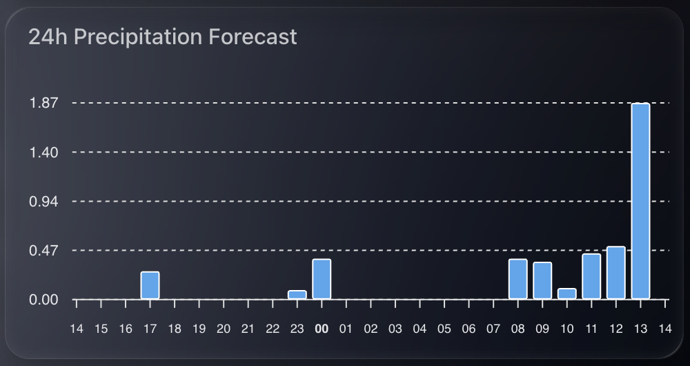
    Predbat is brilliant at building smart charging and discharging plans for my home battery system, based on real-time energy costs, predicted house load, and solar forecasts. It uses Solcast data to predict generation and works out the best times to import, export, or hold energy.

    predbat table card weather columns

    But while Solcast takes weather into account when generating its solar forecast, I often found myself wondering why a particular slot was being scheduled a certain way. Was it cloudy? Raining? Very hot? All of these could affect either solar production or battery efficiency.

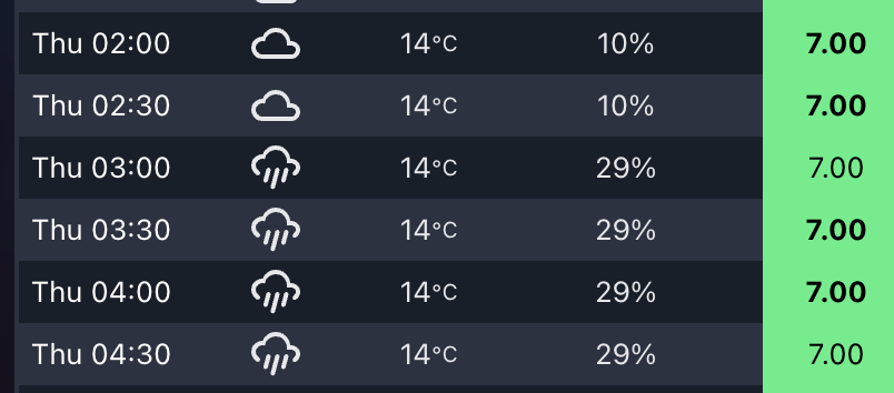
    That’s when I decided to bring weather information directly into the Predbat Table Card.

    Why Add Weather to the Table?

    Although Predbat itself does not use the weather entity directly, it’s still useful to overlay forecast conditions with the battery plan. This extra context helps me better understand why certain slots are heavy on import or export, especially when the solar forecast looks optimistic but the weather conditions are less than ideal.

    By seeing temperature, cloud cover, or rain in each 30-minute slot, I can cross-reference the charging plan with real-world weather, and make sense of some edge-case decisions.

    How the Integration Works

    The Predbat Table Card supports optional weather and temperature columns through two features I added:

    • weather-column: shows a weather icon for the slot
    • temp-column: shows the predicted temperature
    • rain-column: shows the predicted chance of rain

    To enable them, you need a valid forecast-capable weather entity in Home Assistant and to define it using weather_entity.

    Example Configuration

    Here’s how I set it up in my YAML:

    type: custom:predbat-table-card
    title: Predbat Plan with Weather
    weather_entity: weather.forecast_home
    columns:
      - time-column
      - weather-column
      - temp-column
        - rain-column
      - import-column
      - state-column

    You can of course rearrange or add more columns like export-column, load-column, or soc-column etc as needed.

    Notes on Forecast Compatibility

    This feature only works with forecast-style weather entities that follow the Home Assistant spec. Tested working examples include:

    • weather.met_home (from Met.no)
    • weather.weatherflow_forecast (from the WeatherFlow integration)
    • weather.met_office_yourlocation (from the Met Office weather integration)

    If the weather forecast does not cover the full duration of the Predbat plan (e.g. forecast ends before the plan does), then no weather icon or temperature will show for those slots.

    Colour-Coding and Hover Details

    To quickly spot critical conditions, the table applies colour coding:

    • Red: temperature over 25°C – which could reduce solar panel efficiency
    • Blue: temperature below 0°C – which could reduce battery efficiency

    Each icon also supports mouse-over tooltips, where you can view the detailed weather condition and temperature value.


    If you want to try this yourself, grab the latest version of Predbat Table Card and follow the weather column documentation.

  • Building a Hourly Rain Forecast Chart in Home Assistant

    I’ve been playing around with ways to better visualise upcoming rainfall. The main weather integrations in Home Assistant often focus on current conditions or broad daily forecasts, but I wanted something more granular.

    Chart showing hourly rainfall

    Specifically, I wanted to see hourly rainfall predictions for the next 24 hours in a compact, clean, and useful format. Ideal for deciding if I need to bring the washing in or delay watering the garden. Here’s how I set it up.

    Step 1: Create the Input Text Helper (YAML)

    First, we need a place to store the hourly rainfall values. I created a simple input_text helper in configuration.yaml. This holds a JSON string that we can read later in the chart.

    Here’s the code to add:

    input_text:
      hourly_forecast_json:
        name: Hourly Forecast JSON
        initial: ""
        max: 255

    Note: The default limit is 255 characters, which fits roughly 24 hourly values. If you want to expand this for a longer range, you can increase the max value — for example, set max: 1024 for future-proofing.

    Once added, restart Home Assistant to activate the helper.

    Step 2: Pull the Hourly Forecast Data

    Next, I created an automation that fetches the next 24 hours of hourly weather data from my forecast provider. It extracts just the precipitation values and stores them as a JSON array in the helper.

    This runs every 5 minutes to keep the data fresh:

    alias: Update Hourly Forecast
    description: ""
    trigger:
      - platform: time_pattern
        minutes: "/5"
    action:
      - service: weather.get_forecasts
        data:
          type: hourly
        target:
          entity_id: weather.my_forecast_provider
        response_variable: forecast_data
    
      - service: input_text.set_value
        data:
          entity_id: input_text.hourly_forecast_json
          value: >
            {{
              forecast_data['weather.my_forecast_provider'].forecast[:24]
              | map(attribute='precipitation')
              | list
              | to_json
            }}
    mode: single

    This gives you a neat string like [0.0, 0.2, 0.4, 0.0, ...] representing each hour’s predicted rainfall in millimetres.

    Step 3: Display the Chart with ApexCharts

    I wanted the final chart to be small, clean, and focused. Using apexcharts-card, I built a column chart that only shows hours where rain is expected — zeroes are filtered out to reduce clutter.

    Here’s the YAML for the card:

    - type: custom:apexcharts-card
      header:
        title: 24h Precipitation Forecast
        show: true
      graph_span: 24h
      span:
        start: hour
      yaxis:
        - min: 0
          decimals: 2
      series:
        - entity: sun.sun  # dummy entity to enable chart
          name: Rain (mm)
          type: column
          color: rgb(76, 166, 238)
          data_generator: |
            try {
              const raw = hass.states['input_text.hourly_forecast_json']?.state;
              if (!raw || !raw.startsWith("[")) return [];
              const data = JSON.parse(raw);
              if (!Array.isArray(data)) return [];
              const now = new Date();
              now.setMinutes(0, 0, 0);  // align to hour start
              return data.reduce((acc, val, i) => {
                if (val !== 0) {
                  const time = new Date(now.getTime() + i * 3600 * 1000).getTime();
                  acc.push([time, val]);
                }
                return acc;
              }, []);
            } catch (e) {
              console.error("ApexCharts data_generator error:", e);
              return [];
            }
      apex_config:
        chart:
          height: 200px
        tooltip:
          enabled: false
        plotOptions:
          bar:
            columnWidth: 14
            borderRadius: 1
        stroke:
          width: 1
          colors:
            - "#FFFFFF"
        dataLabels:
          offsetY: -10
          style:
            fontSize: 9
        xaxis:
          labels:
            hideOverlappingLabels: false
            rotate: 90
            show: true
            style:
              fontSize: 9
            format: HH
        yaxis:
          show: false
        legend:
          show: false

    This chart gives a very quick heads-up on upcoming rain intensity. Because it only shows hours with rain (zero values are filtered out), it’s minimal and takes up little space. It works well on both mobile and wall-mounted dashboards.

    More importantly, it pulls real hourly forecast data rather than estimates or summaries. You get the precise precipitation expected in millimetres for each hour. Handy if you’re deciding whether to pause a garden irrigation schedule or go out for a walk.