One of the most powerful aspects of Home Assistant is being able to stitch together data from multiple sources to create meaningful insights. In this post, I’ll walk through how I created a sensor that compares the predicted solar generation against the actual solar energy generated by my system, giving me a live percentage difference throughout the day.
This is particularly useful to understand how accurate your solar predictions are, and whether your solar generation is outperforming (or underperforming) expectations as the day progresses.
Why this sensor?
I use Predbat to manage my solar battery charging and discharging logic. One of its inputs is a daily solar PV forecast, which it sources from Solcast (if configured).
While my GivEnergy inverter provides solar generation figures, I’ve found that the SolarEdge integration (via my SolarEdge export meter) provides more accurate daily totals. You can install a SolarEdge integration through Home Assistant if you have this setup. So for this comparison, I use:
- Predbat’s
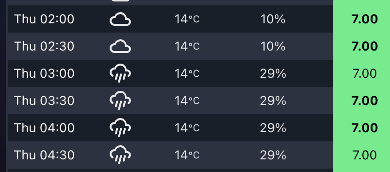
detailedForecastattribute fromsensor.predbat_pv_todayfor the expected PV generation in 30 minute slots - SolarEdge’s
sensor.solaredge_energy_todayas the actual generated PV value
How it works
The custom template sensor does the following:
- Iterates over each 30-minute slot in the Predbat
detailedForecast. - Sums up all past PV forecasts (based on current time) to create a "so-far" forecast.
- Compares that to the actual solar generated today from SolarEdge.
- Calculates the percentage difference, showing how far above or below the forecast we are right now.
This is a dynamic sensor, updating as time passes and more of the forecast becomes "in the past."
What it tells me
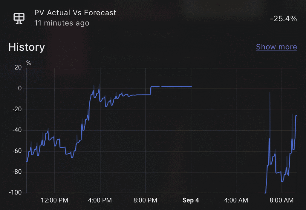
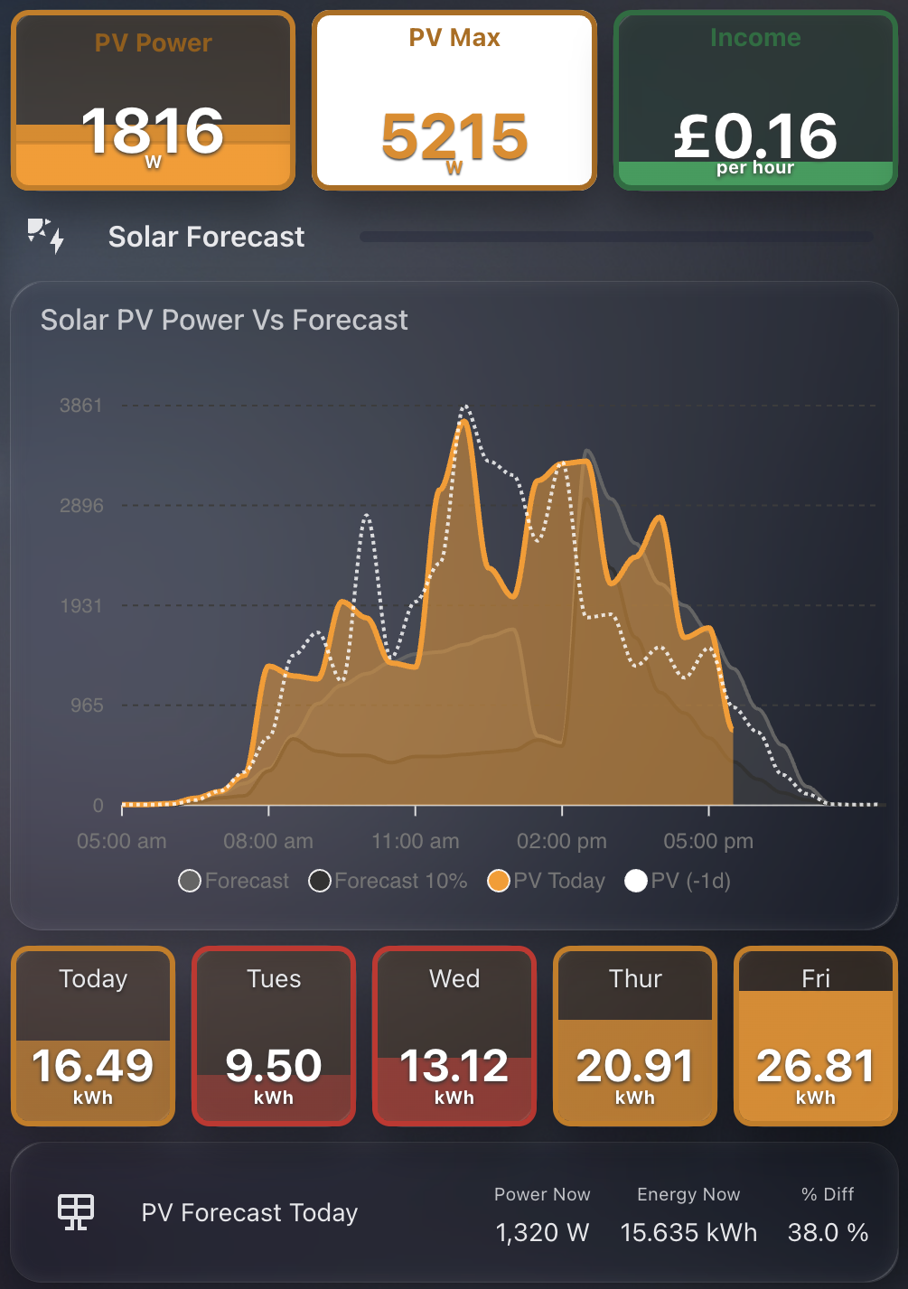
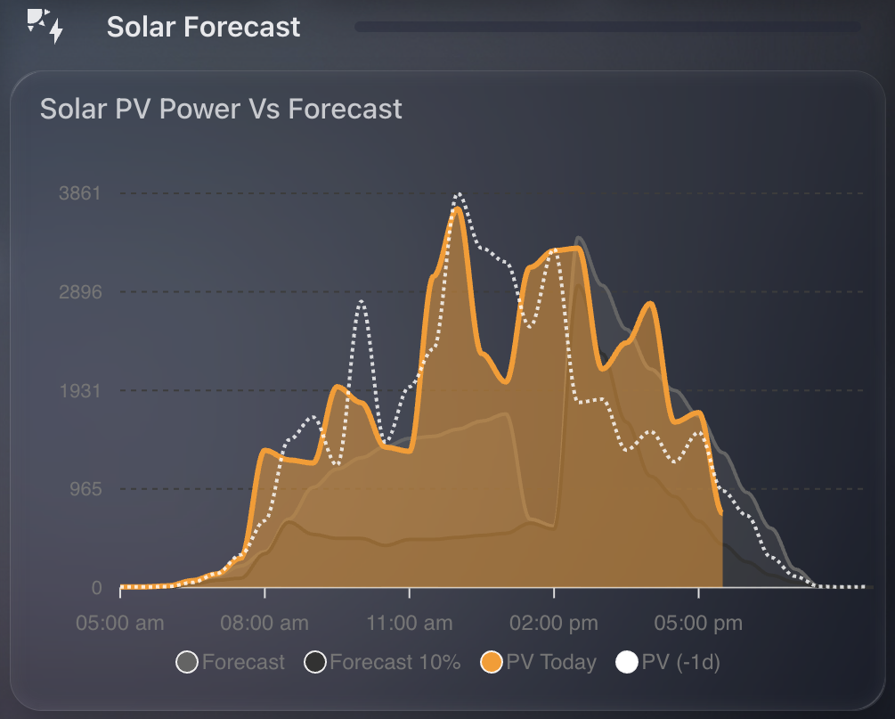
The resulting percentage gives me a clear sense of solar performance in real time. For example:
- If the value is positive, I’m generating more than expected.
- If it’s negative, I’m falling behind the forecast.
This can help explain battery decisions, why Predbat may or may not be dispatching energy, and offer insight into Solcast’s accuracy over time. I tend to find, due to the nature of the solarEdge updates, that the PV predicted is always higher than what I have achieved, but slowly throughout the day it catches up. Sometimes I get lucky and outperform the PV prediction!
Predbat’s DetailedForecast attribute
Within the PV prediction entity for today, Predbat provides a DetailedForecast attribute, which is a 30 minute breakdown. My sensor is based on pv_estimate, but you can choose whichever you want, just update the YAML accordingly.
DetailedForecast
    - period_start: 2025-09-04T15:30:00+0000
        pv_estimate: 1.96
        pv_estimate10: 0.6
        pv_estimate90: 2.44
        pv_estimateCL: 1.66
    - period_start: 2025-09-04T16:00:00+0000
        pv_estimate: 1.76
        pv_estimate10: 0.48
        pv_estimate90: 2.08
        pv_estimateCL: 2.01
The Template Sensor YAML
Below is the full YAML snippet you can use in your configuration.yaml or template sensor configuration file:
sensor:
  - name: "PV Actual Vs Forecast"
    unique_id: pv_actual_vs_forecast
    state_class: "measurement"
    unit_of_measurement: "%"
    state: >
      {% set total = namespace(value=0) %}
      {% for item in state_attr('sensor.predbat_pv_today', 'detailedForecast') %}
          {% if item.pv_estimate is number %}
              {% if strptime(item.period_start, "%Y-%m-%dT%H:%M:%S%z") <= now() %}
                  {% set total.value = total.value + (item.pv_estimate / 2) %}
              {% endif %}
          {% endif %}
      {% endfor %}
      {% set currentSolar = states('sensor.solaredge_energy_today') | float %}
      {% set absolute_difference = currentSolar - total.value %}
      {% set percentage_difference = (absolute_difference / total.value) * 100 %}
      {{ percentage_difference }}
    icon: mdi:solar-panel
Note: The division by 2
(item.pv_estimate / 2)accounts for each forecast slot being half an hour, and we wantpv_estimateto be the kWh value.