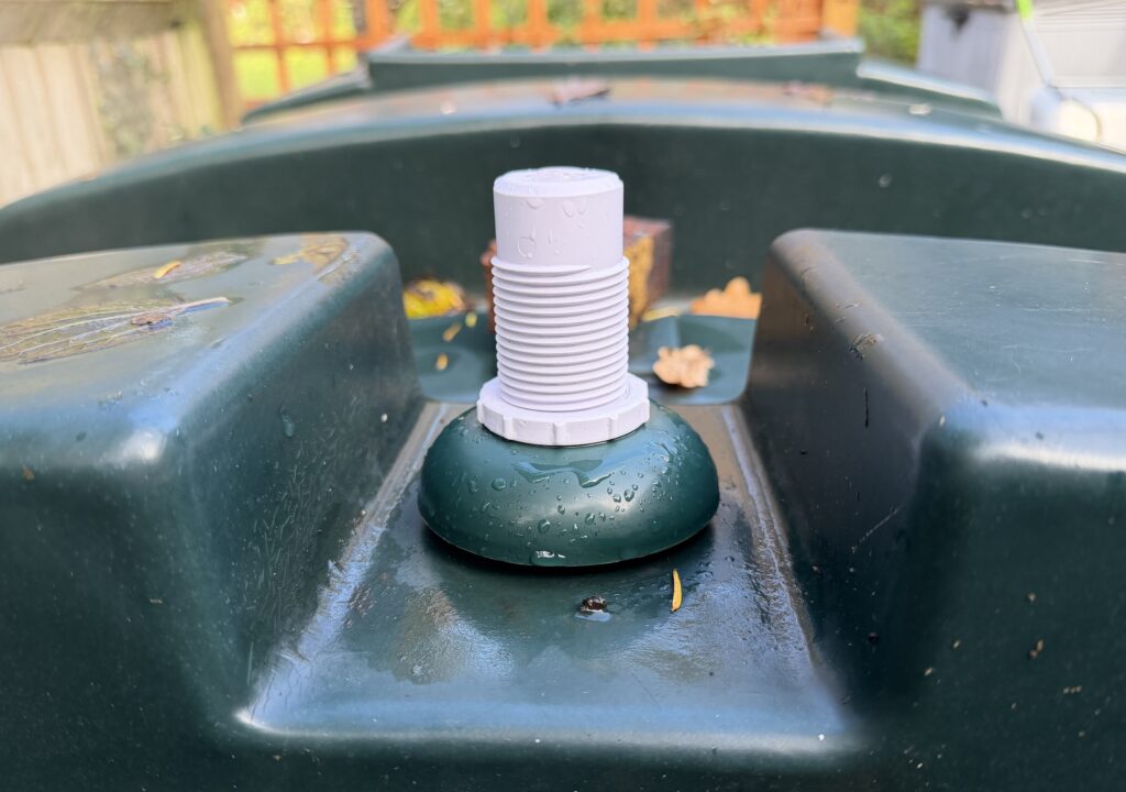
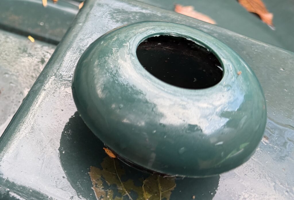
Some of you will have seen my previous posts about the Shelly BLU Distance, how I set it up and installed it on my heating oil tank.
After a few weeks of it in place, I wanted to report back on its effectiveness and if its worth your time and money.
Recap on the use-case
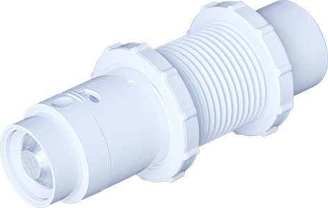
My plan was to replace my offline oil tank measuring device to an online measuring device, allowing me to trigger alerts when the tank was low, and for me to be able to monitor and predict when I might need to re-order kerosene. The Shelly BLU Distance seemed to fit that bill, a low energy, battery powered device that could measure the distance between itself and other objects or liquids. It could be installed vertically or horizontally, seemingly perfect for my needs. There are some limitations with the device documented, specifically:
Measurement range: 200 mm – 5000 mm
Accuracy: from 20 cm to 200 cm : +/- 2cm above 200 cm: +/- 1%
Measure interval: Valid range = 5 seconds to 300 seconds. Default – 30 seconds
These seemed fine, I dont need realtime measurement so 5-300 seconds works for me. The accuracy is a little bit of a downer, my tank is 1080mm in height, so a 20mm difference in accuracy is a significant amount of oil, but it was good enough. I installed the device, integrated with home assistant, and off I went.
Immediate impressions
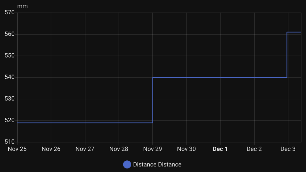
Above is a graph from Home Assistant of the last 8.5 day period, starting with November 25th 2025. What you will immediately see is the rate of change in the readings is very infrequent. This can be confusing in the first hours and days – you are wondering if its a bluetooth signal issue, or something else. I quickly debugged the connectivity, by looking at the Shelly App device page. You will see the "last reporter" which can confirm how long ago a bluetooth gateway device received data from the Distance device:
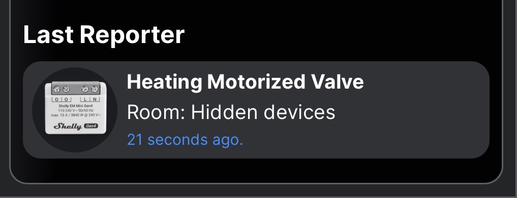
In my case, it was updating every 30 seconds as I expected – but no change in the mm measured by the device.
So I waited, and waited. Heating oil was being used up (est. 10 litres per day) which was definitely changing the distance of the liquid in the tank from the device, but nothing happened.
Reality of the Shelly BLU Distance
Eventually, the device gave me an update after 4-5 days, it jumped from 519mm to 540mm liquid distance from the device – FINALLY consumption! 4 days later it did it again, 540mm to 561mm. Both times this value change came through just after midnight. Some observations:
Update frequency
While the accuracy documented mentioned accuracy of "+/- 2cm" (though re-reading the document its not very clear!!!), I expected that to mean "the measurement reported will be +/- 2cm". What it seems to actually mean is that "the measurement reported will update only when there is a change at 2cm".
Take a look at my readings again, both times the device only updated when a change in 21mm was realised. In my tank that is around 40L of usage / change in liquid levels (that will change over time as the tank is round, so 20mm isn’t always 40L – it just is where it is right now).
Update timing
As I mentioned, both updates came just after midnight. Interestingly at both of these moments, no oil changes were happening. I have my heating and hot water turned off at night, from 10pm every night. So it took the Shelly just over 2 hours to recognise the liquid level change and report it back.
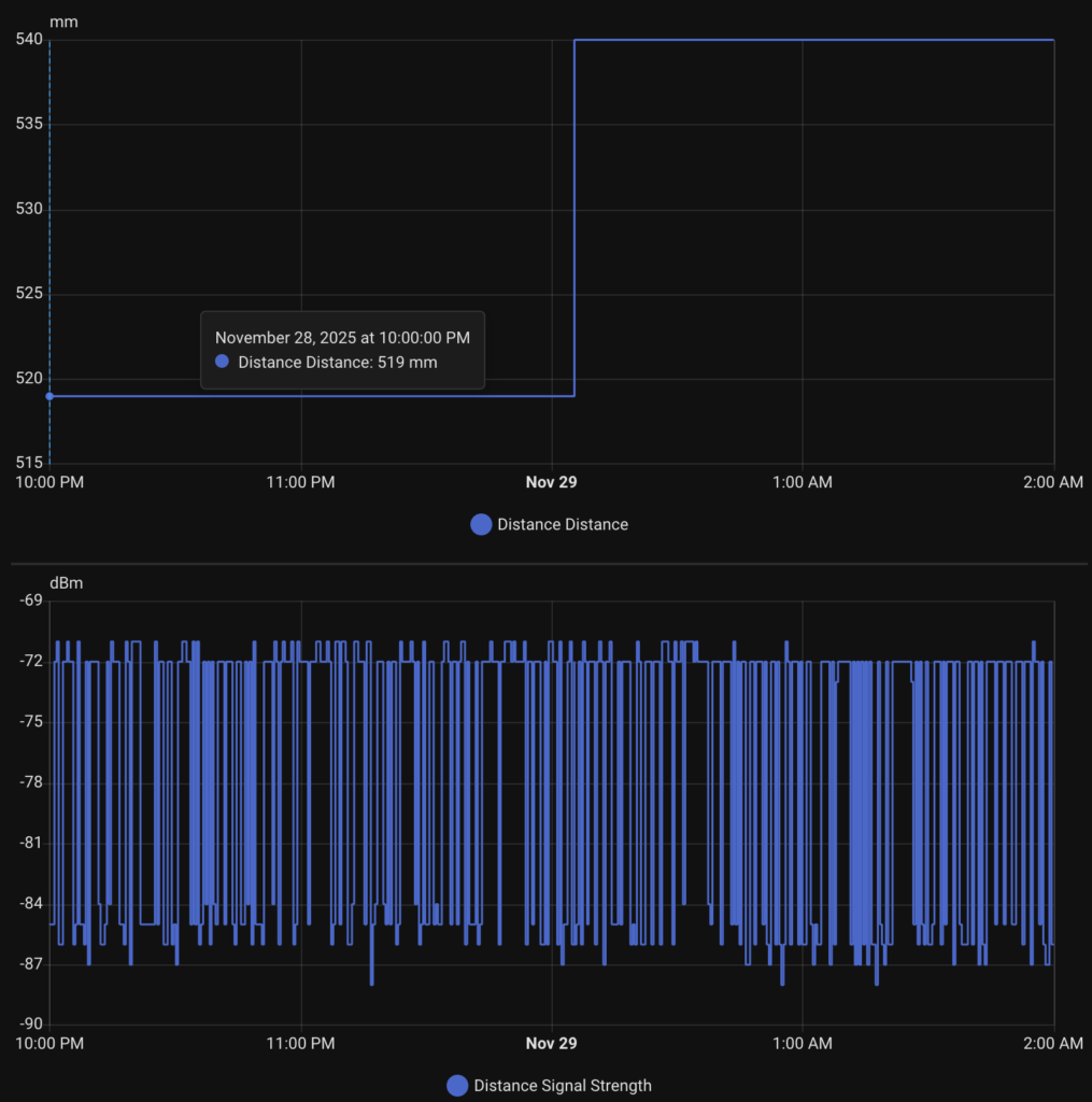
Again this was not due to connectivity, I can see consistantly good updates every 30 seconds (I am measuring signal strength from the device which is updated all the time). I have no idea why it would take so long to report the change when the oil level is static for so long.
Disappointed.
Frankly, I am disappointed with the device as sold. Yes it is measuring, but the delays, accuracy and timing of the updates just don’t fill me with any confidence about my tank levels – which is REALLY what I need in winter. I hope Shelly can do something with a firmware update to improve these findings. Would love to hear your thoughts and experience – please add comments here.