As a parent juggling the school run every morning, there’s one thing I really don’t enjoy – scraping ice off the car while trying to wrangle two teenagers and get out the door on time. So I’ve automated the process of pre-heating and defrosting my Tesla using my WeatherFlow Tempest weather station and Home Assistant.

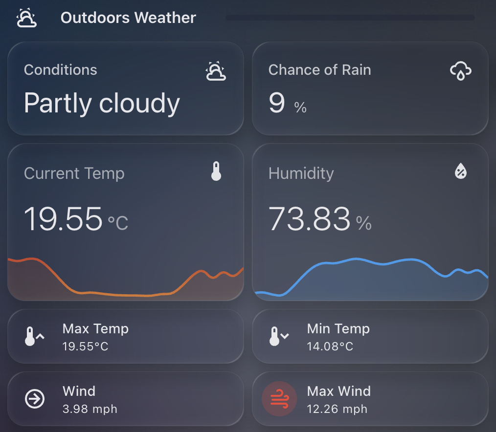
WeatherFlow Tempest is a smart weather station that gives me highly accurate outdoor temperature data from my own garden. More accurate, in fact, than the Tesla’s own temperature sensors when the car is asleep.
I use the Tessie integration in Home Assistant to communicate with my car. It allows me to send commands like “turn on climate control” even when the Tesla is sleeping, without the delay or failure that sometimes occurs with the native Tesla integration.
Why Use Tempest Instead of Tesla’s Own Temperature Reading?
Tesla goes into a deep sleep mode overnight to conserve energy. That’s great for battery life, but not so great if you want reliable temperature data in the early morning. The external temperature reported by the car can be outdated or missing altogether until the car is awake and responsive.
Instead, I rely on my WeatherFlow Tempest’s temperature sensor, which continues to report accurate live data overnight.
The Automation Setup
Every weekday morning at exactly 8.00am, my Home Assistant instance checks the current outside temperature reported by the Tempest. If it’s below 3°C, the automation triggers Tessie to enable climate control in the car for 15 minutes – enough to warm the cabin and defrost the windows. I also make sure I only set this on school days.
I also receive a notification letting me know that the defrost has been enabled.
Here’s the automation in full:
alias: Warm Car Automation
description: At 08.00 every school day check outside temp and defrost if below 3C
mode: single
triggers:
  - at: "08:00:00"
    platform: time
conditions:
  - condition: time
    weekday:
      - mon
      - tue
      - wed
      - thu
      - fri
  - condition: numeric_state
    entity_id: sensor.tempest_temperature
    below: 3
actions:
  - service: climate.turn_on
    target:
      entity_id: climate.none_climate
  - service: notify.notify
    data:
      message: "Car Defrost Enabled for 15 mins"
  - service: notify.persistent_notification
    data:
      title: "Car Defrost Enabled"
      message: "Car Defrost Enabled for 15 mins"
You can take this further by:
- Tracking how often the automation is triggered using a counter or helper.
- Adding a secondary check for battery level to avoid defrosting if your range is low.
- Turning the climate off again after a set duration (or allowing Tesla’s own timeout to do it for you).
This small quality-of-life improvement saves me time and hassle every winter morning, and it’s yet another example of how Home Assistant can bring together multiple smart devices into a seamless routine.