A small tweak to the Predbat Table Card has enabled a really cool new use-case – MINI Predbat table cards!
Github user @stiplady made a request to add a limit to the number of rows the plan returns, for "quick look" style functionality. A pretty easy change, but has unlocked some very cool functionality.
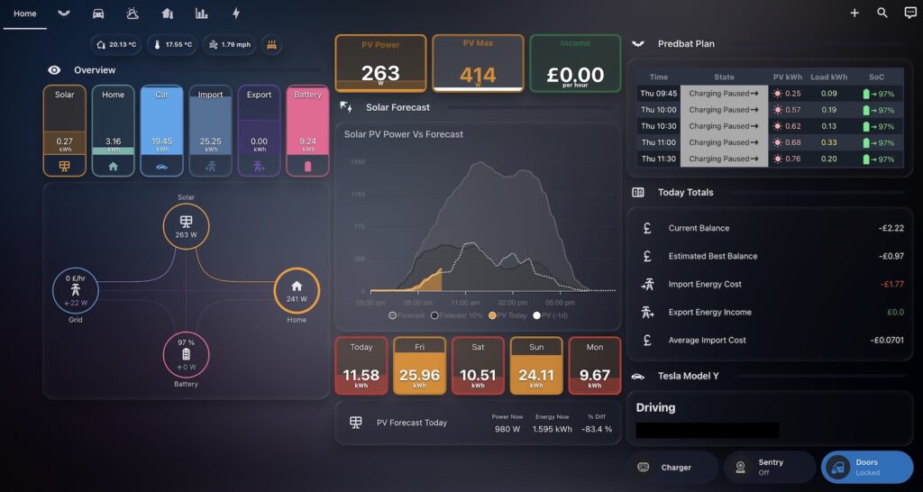
Predbat mini card on a home assistant dashboard
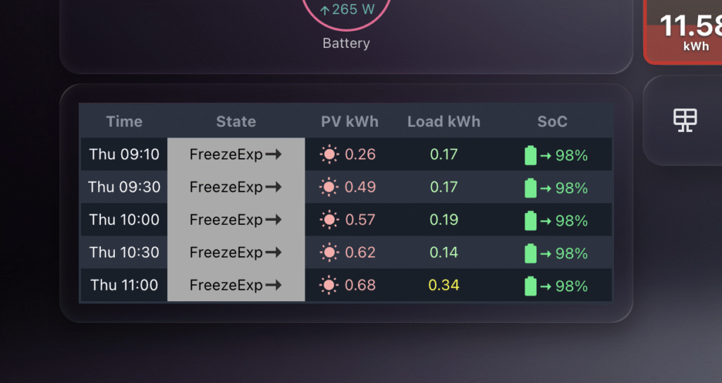
By limiting the number of rows, users can now combine this functionality with custom columns and font size to create a mini Predbat table card on bigger dashboards.
Previous to this, while you could limit the columns, the plan was usually 24 hours long, so at least 48 rows of data – which was not great for dashboards with other cards in place.
Close up of the Predbat Table Card MINI
As you can see in the images above, placing the table card nicely in a dashboard is now super easy!
Here’s the YAML you can use to get started – obviously feel free to customise the YAML to meet your needs according to the spec.
Predbat is brilliant at building smart charging and discharging plans for my home battery system, based on real-time energy costs, predicted house load, and solar forecasts. It uses Solcast data to predict generation and works out the best times to import, export, or hold energy.
But while Solcast takes weather into account when generating its solar forecast, I often found myself wondering why a particular slot was being scheduled a certain way. Was it cloudy? Raining? Very hot? All of these could affect either solar production or battery efficiency.
That’s when I decided to bring weather information directly into the Predbat Table Card.
Why Add Weather to the Table?
Although Predbat itself does not use the weather entity directly, it’s still useful to overlay forecast conditions with the battery plan. This extra context helps me better understand why certain slots are heavy on import or export, especially when the solar forecast looks optimistic but the weather conditions are less than ideal.
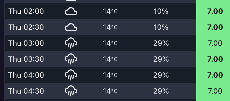
By seeing temperature, cloud cover, or rain in each 30-minute slot, I can cross-reference the charging plan with real-world weather, and make sense of some edge-case decisions.
How the Integration Works
The Predbat Table Card supports optional weather and temperature columns through two features I added:
weather-column: shows a weather icon for the slot
temp-column: shows the predicted temperature
rain-column: shows the predicted chance of rain
To enable them, you need a valid forecast-capable weather entity in Home Assistant and to define it using weather_entity.
You can of course rearrange or add more columns like export-column, load-column, or soc-column etc as needed.
Notes on Forecast Compatibility
This feature only works with forecast-style weather entities that follow the Home Assistant spec. Tested working examples include:
weather.met_home (from Met.no)
weather.weatherflow_forecast (from the WeatherFlow integration)
weather.met_office_yourlocation (from the Met Office weather integration)
If the weather forecast does not cover the full duration of the Predbat plan (e.g. forecast ends before the plan does), then no weather icon or temperature will show for those slots.
Colour-Coding and Hover Details
To quickly spot critical conditions, the table applies colour coding:
Red: temperature over 25°C – which could reduce solar panel efficiency
Blue: temperature below 0°C – which could reduce battery efficiency
Each icon also supports mouse-over tooltips, where you can view the detailed weather condition and temperature value.
If you want to try this yourself, grab the latest version of Predbat Table Card and follow the weather column documentation.
As part of my growing Home Assistant dashboard, I’ve built a custom section to track the mileage of my electric vehicle (EV), a Tesla Model Y. It helps me visualise how I’m progressing against my lease’s mileage allowance – not just the total driven, but also how I’m pacing day to day.
This dashboard has become one of the most valuable tools in my setup, especially with a leased EV where tracking your usage is critical to avoiding end-of-term penalties.
Data Source: Tessie Integration
I’m using the excellent Tessie integration to pull live data from my Tesla. It provides an entity for the odometer (sensor.none_odometer in my case), which powers all the mileage tracking. none here is the car’s name – I hadn’t named it when I installed the integration, and now its stuck there in the entity names.
Lease Parameters
Start date: 10 February 2024
End date: 9 February 2027
Total allowed: 45,000 miles (15,000 miles per year)
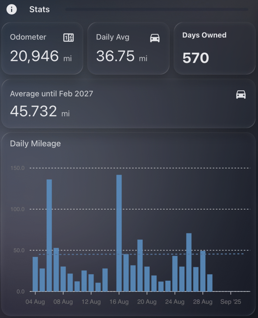
What I Show on the Dashboard
My Tesla mileage dashboard includes:
Odometer: current total mileage (live from Tessie)
Daily Avg: my average daily mileage since delivery
Days Owned: how many days since I took delivery
Target Daily Avg: how many miles I can drive per day from today to stay within my lease cap
ApexCharts Graph: daily mileage (bars) vs. target daily average (dotted line)
This gives me a clear visual indication of whether I’m tracking well or over-driving. The Target Daily Avg is based on how many miles I have used so far, and calculating the number of days remaining in the lease, so dividing mileage remaining / days left.
ApexCharts Graph
I use the apexcharts-card custom card to plot two data series:
Daily mileage from a helper or automation that tracks daily odometer deltas
Target average from a template sensor (see below)
The bar chart gives a good at-a-glance view, with the dotted line acting as a benchmark to compare against.
Template Sensors
These sensors do the logic for tracking averages.
1. Daily Average Since Delivery
- sensor:
    - name: "Average Tesla Mileage"
      unique_id: average_tesla_mileage
      state_class: "total"
      device_class: "distance"
      unit_of_measurement: "mi"
      state: >
        {% set specific_date = "2024-02-10" %}
        {% set current_date = now().date() %}
        {% set specific_date_obj = as_timestamp(specific_date) %}
        {% set current_date_obj = as_timestamp(current_date) %}
        {% set days_since_specific_date = ((current_date_obj - specific_date_obj) / 86400) | round(0, 'ceil') %}
        {% set mileage = states('sensor.none_odometer') | int %}
        {{ (mileage / days_since_specific_date) }}
      icon: mdi:car
2. Target Daily Allowance Until Lease Ends
- sensor:
    - name: "Average Tesla Mileage Remaining"
      unique_id: average_tesla_mileage_remaining
      state_class: "total"
      device_class: "distance"
      unit_of_measurement: "mi"
      state: >
        {% set specific_date = "2027-02-09" %}
        {% set current_date = now().date() %}
        {% set specific_date_obj = as_timestamp(specific_date) %}
        {% set current_date_obj = as_timestamp(current_date) %}
        {% set days_until_specific_date = ((specific_date_obj - current_date_obj) / 86400) | round(0, 'ceil') %}
        {% set mileage = states('sensor.none_odometer') | int %}
        {% set mileage_remaining = 45000 - mileage %}
        {{ (mileage_remaining / days_until_specific_date) }}
      icon: mdi:car
Markdown Card: Days Owned
This card is created using a simple markdown card that calculates the number of days since delivery:
- type: markdown
  content: >-
    #### Days Owned

    {% set specific_date = "2024-02-10" %}
    {% set current_date = now().date() %}
    {% set specific_date_obj = as_timestamp(specific_date) %}
    {% set current_date_obj = as_timestamp(current_date) %}
    {% set days_since_specific_date = ((current_date_obj - specific_date_obj) / 86400) | round(0, 'ceil') %}

    # {{ days_since_specific_date }}
It displays a nice clean numeric summary alongside the stats and graph.
Example Stats (as of today)
Odometer: 20,946 miles
Daily Avg: 36.75 miles
Target Avg: 45.73 miles
Days Owned: 570 days
So I’m under the target, which gives me some breathing room for long trips.
Predbat from springfall2008 is a fantastic custom integration for Home Assistant that intelligently manages solar battery charging and discharging based on predicted solar generation and energy tariffs. It’s especially helpful for optimising when to charge from the grid or discharge to avoid peak tariffs, and it’s saved me a decent amount on my energy bill.
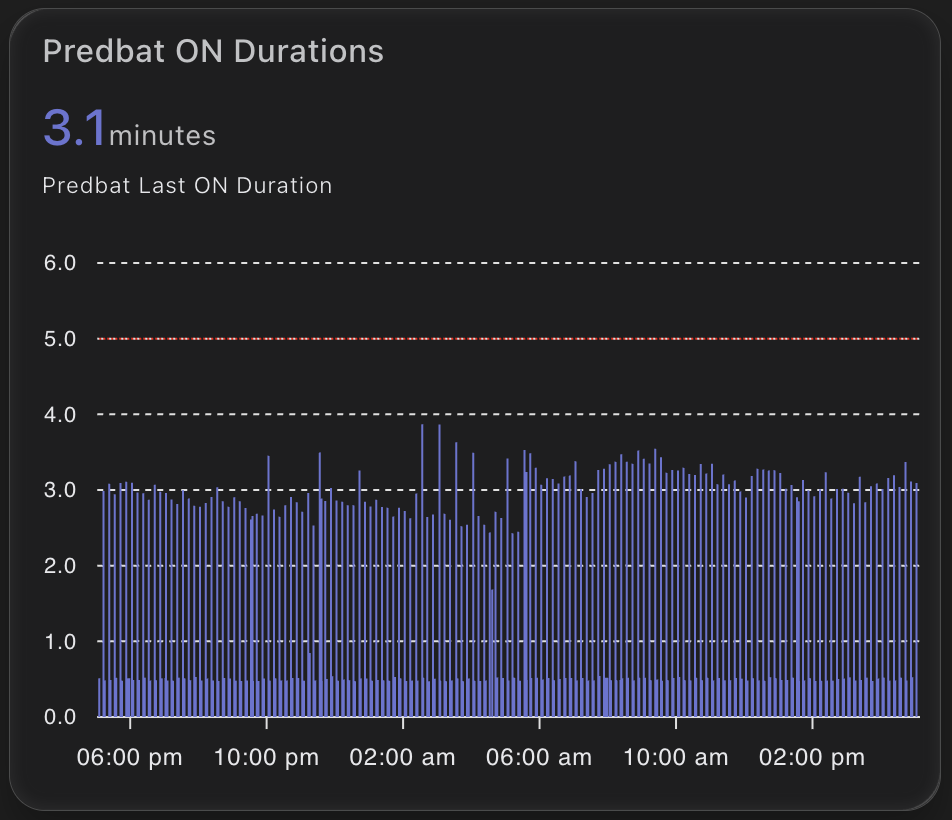
But like any planning tool, Predbat needs time to generate its plan. Most of the time it does this quickly – but occasionally it can take a little longer. I wanted a way to visualise and track how long Predbat was taking to generate its plan each time it ran.
Why track Predbat’s ON time?
The provided switch.predbat_active entity goes into the on state when Predbat is generating a new plan. Once complete, it switches back to off. By measuring how long it remains ON, I can catch cases where Predbat is taking longer than expected.
If it ever takes more than 5 minutes, I want to know – either through a notification or visually via my dashboard.
Step 1: Creating the Sensor
I used a trigger-based template sensor that calculates the duration in minutes that the switch.predbat_active was ON.
Here’s the YAML for the sensor:
- trigger:
    - platform: state
      entity_id: switch.predbat_active
      from: 'on'
      to: 'off'
  sensor:
    - name: Predbat Last ON Duration
      unique_id: predbat_last_on_duration
      state: >
        {{ (as_timestamp(now()) - as_timestamp(trigger.from_state.last_changed)) / 60 }}
      unit_of_measurement: "minutes"
      icon: mdi:timer
This sensor will only update when the switch turns OFF. It records how many minutes it was ON – which is effectively how long Predbat took to generate its plan.
Step 2: Visualising ON Durations in ApexCharts
To make this information more useful, I plotted it using the excellent ApexCharts card for Home Assistant.
This renders a neat column chart of how long each plan generation took. The red annotation line at 5 minutes gives a clear visual cue if something is taking too long.
Notifications and Automations
Now that we have this entity, its a simple job to create a notification if the ON time is longer than my desired 5 minutes. Just use the new entity to trigger a notification to home assistant or your mobile device.