One of the most satisfying parts of running a home solar setup is being able to visualise how your system performs compared to the forecast, how its performing financially, and how might it perform in the next few days.

In this walkthrough I’ll explain at a high level how I’ve combined Solcast, Predbat & Octopus Energy integrations, with Bar Card, Apex Charts and more to get a really great looking dashboard. I’ll do a deeper dive on how its all possible soon.
Live PV Overview Using Bar Card

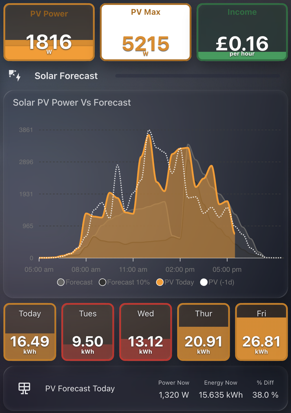
At the top of this section, I use a compact bar-card layout to display:
- PV Power: current output from my solar inverter
- PV Max: the peak output so far today
- Income: estimated real-time value in £/hour based on grid interaction
These are not standard stat cards. They are styled bar-card elements, which give me better layout control and a consistent visual design.
The live PV data (including PV Power and Max) comes from my GivEnergy system, using the excellent GivTCP integration. GivTCP is a local MQTT-based integration that makes real-time data from both the GivEnergy battery and inverter available in Home Assistant. It is fast, reliable, and fully local, which is ideal for anyone running GivEnergy hardware.
The income figure is calculated using a template sensor that combines live import/export power with live tariff rates from the Octopus Energy integration. This gives a real-time estimate of financial benefit, whether from exported power or avoided import during peak rates. It updates every few seconds and is one of the most useful numbers on the dashboard. The bar card also dynamically changes colour, red for import, green for export.
Solar PV Forecast vs Actual Chart

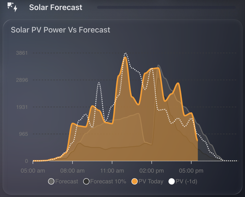
This section is powered by ApexCharts Card and visualises:
- Solcast Forecast (grey)
- 10% Confidence Range (dark grey)
- Actual PV Today (orange)
- PV from Yesterday (white dotted line)
It provides a live comparison throughout the day. I can instantly see whether production is tracking above or below expectations, and by how much.
The forecast data is retrieved via Predbat. Predbat serves as the bridge between Solcast and Home Assistant, pulling in high-resolution forecasts and exposing them as sensors. I then feed these directly into the chart.
5-Day Forecast Using Bar Card

Just below the chart, I show a 5-day solar forecast using bar-card again. This includes:
- The Forecast for today and the next 4 days
- Colour-coded bars based on expected total generation
Each bar represents total energy (kWh) for the day, with dynamic colouring applied using templates. Lower days show in red, wheras higher days in orange. I’ve configured these in such a way that it uses entities for max PV values (35 kWh in my case) as well as my "threshold" for minimum (around your average use). This enables the dynamic colour coding of the bars.
If you want to replicate this setup, I’ve created a full walkthrough: PV Card Preview GitHub Repo
The guide includes:
- How to access and format forecast data from Predbat
- Template examples for value display and colour thresholds
- Complete YAML for the 5-day bar-card layout
Forecast vs Reality Delta

At the bottom of this section, I include a summary of:
- Forecasted PV power for right now
- Forecasted PV energy for right now
- Percentage difference between the forecast and reality
For example, as of this image I am 38% up on the forecasted PV energy generation today. These numbers dynamically change as the hours go during the day, giving me a strong signal for how much better or worse reality is compared to the prediction.