Tag: Custom Cards

  • Building a Hourly Rain Forecast Chart in Home Assistant

    I’ve been playing around with ways to better visualise upcoming rainfall. The main weather integrations in Home Assistant often focus on current conditions or broad daily forecasts, but I wanted something more granular.

    Chart showing hourly rainfall

    Specifically, I wanted to see hourly rainfall predictions for the next 24 hours in a compact, clean, and useful format. Ideal for deciding if I need to bring the washing in or delay watering the garden. Here’s how I set it up.

    Step 1: Create the Input Text Helper (YAML)

    First, we need a place to store the hourly rainfall values. I created a simple input_text helper in configuration.yaml. This holds a JSON string that we can read later in the chart.

    Here’s the code to add:

    input_text:
      hourly_forecast_json:
        name: Hourly Forecast JSON
        initial: ""
        max: 255

    Note: The default limit is 255 characters, which fits roughly 24 hourly values. If you want to expand this for a longer range, you can increase the max value — for example, set max: 1024 for future-proofing.

    Once added, restart Home Assistant to activate the helper.

    Step 2: Pull the Hourly Forecast Data

    Next, I created an automation that fetches the next 24 hours of hourly weather data from my forecast provider. It extracts just the precipitation values and stores them as a JSON array in the helper.

    This runs every 5 minutes to keep the data fresh:

    alias: Update Hourly Forecast
    description: ""
    trigger:
      - platform: time_pattern
        minutes: "/5"
    action:
      - service: weather.get_forecasts
        data:
          type: hourly
        target:
          entity_id: weather.my_forecast_provider
        response_variable: forecast_data
    
      - service: input_text.set_value
        data:
          entity_id: input_text.hourly_forecast_json
          value: >
            {{
              forecast_data['weather.my_forecast_provider'].forecast[:24]
              | map(attribute='precipitation')
              | list
              | to_json
            }}
    mode: single

    This gives you a neat string like [0.0, 0.2, 0.4, 0.0, ...] representing each hour’s predicted rainfall in millimetres.

    Step 3: Display the Chart with ApexCharts

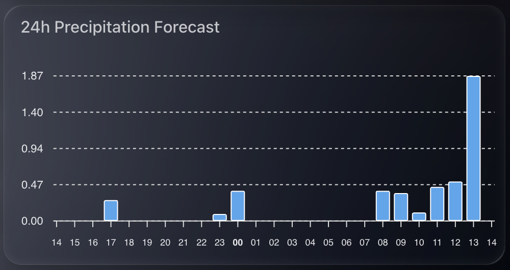
    I wanted the final chart to be small, clean, and focused. Using apexcharts-card, I built a column chart that only shows hours where rain is expected — zeroes are filtered out to reduce clutter.

    Here’s the YAML for the card:

    - type: custom:apexcharts-card
      header:
        title: 24h Precipitation Forecast
        show: true
      graph_span: 24h
      span:
        start: hour
      yaxis:
        - min: 0
          decimals: 2
      series:
        - entity: sun.sun  # dummy entity to enable chart
          name: Rain (mm)
          type: column
          color: rgb(76, 166, 238)
          data_generator: |
            try {
              const raw = hass.states['input_text.hourly_forecast_json']?.state;
              if (!raw || !raw.startsWith("[")) return [];
              const data = JSON.parse(raw);
              if (!Array.isArray(data)) return [];
              const now = new Date();
              now.setMinutes(0, 0, 0);  // align to hour start
              return data.reduce((acc, val, i) => {
                if (val !== 0) {
                  const time = new Date(now.getTime() + i * 3600 * 1000).getTime();
                  acc.push([time, val]);
                }
                return acc;
              }, []);
            } catch (e) {
              console.error("ApexCharts data_generator error:", e);
              return [];
            }
      apex_config:
        chart:
          height: 200px
        tooltip:
          enabled: false
        plotOptions:
          bar:
            columnWidth: 14
            borderRadius: 1
        stroke:
          width: 1
          colors:
            - "#FFFFFF"
        dataLabels:
          offsetY: -10
          style:
            fontSize: 9
        xaxis:
          labels:
            hideOverlappingLabels: false
            rotate: 90
            show: true
            style:
              fontSize: 9
            format: HH
        yaxis:
          show: false
        legend:
          show: false

    This chart gives a very quick heads-up on upcoming rain intensity. Because it only shows hours with rain (zero values are filtered out), it’s minimal and takes up little space. It works well on both mobile and wall-mounted dashboards.

    More importantly, it pulls real hourly forecast data rather than estimates or summaries. You get the precise precipitation expected in millimetres for each hour. Handy if you’re deciding whether to pause a garden irrigation schedule or go out for a walk.

  • A Small but Mighty Wind Card in Home Assistant

    As part of refining my Home Assistant dashboards, I wanted a lightweight, dynamic card to show current wind conditions from my Weatherflow Tempest.

    Screenshot 2025-09-01 at 12.36.38

    There are plenty of ways to visualise weather data, but most are either too large, too basic, or just not very readable. I wanted something compact, clean, and glanceable. A quick read, no fluff, and no wasted screen space.

    This is where the Mushroom Template Card really shines. It’s incredibly flexible, looks modern, and lets you pack a surprising amount of intelligence into a small card.

    What I Wanted

    The goal was simple:

    • Show the wind speed in mph.
    • Display a directional icon based on wind direction.
    • Change the icon colour if wind speed is high.
    • Keep it compact, no charts, no clutter.

    All powered by the Tempest sensors I already had in place.

    The YAML

    Here’s the full YAML I ended up with:

    type: custom:mushroom-template-card
    entity: sensor.tempest_wind_speed
    primary: Wind
    secondary: "{{ states('sensor.tempest_wind_speed') | float | round(2) }} mph"

    The secondary line uses Jinja2 to pull the wind speed and round it to two decimal places. I like that this keeps it readable without unnecessary decimals.

    Directional Icon Logic

    The icon is where it gets a bit more clever. If the wind sensor is reporting a valid direction and the wind isn’t zero, we map it to a directional arrow.

    icon: >-
      {% set raw_dir = states('sensor.tempest_wind_direction') %}
      {% set raw_speed = states('sensor.tempest_wind_speed') %}
      {% if raw_dir in ['unknown', 'unavailable', 'none', ''] or raw_speed | float == 0 %}
        mdi:compass
      {% else %}
        {% set d_from = ((raw_dir | float) % 360 + 360) % 360 %}
        {% set d_to = (d_from + 180) % 360 %}
        {% set idx = (((d_to + 22.5) % 360) // 45) | int %}
        {% set icons = [
          'mdi:arrow-up-circle-outline',
          'mdi:arrow-top-right-thin-circle-outline',
          'mdi:arrow-right-circle-outline',
          'mdi:arrow-bottom-right-thin-circle-outline',
          'mdi:arrow-down-circle-outline',
          'mdi:arrow-bottom-left-thin-circle-outline',
          'mdi:arrow-left-circle-outline',
          'mdi:arrow-top-left-thin-circle-outline'
        ] %}
        {{ icons[idx] }}
      {% endif %}

    Let me break that down:

    • If the direction or speed is unknown or zero, we show a generic compass icon.
    • Otherwise, we:
      • Calculate the direction the wind is going to (not coming from).
      • Convert it into an index between 0–7.
      • Map that to one of eight arrow icons using Material Design Icons (MDI).

    This gives a visual indication of direction without needing to read degrees.

    Icon Colour Based on Wind Speed

    Just for a bit of extra UX, I wanted the icon to go red if the wind is high (10+ mph). Otherwise, it uses the theme’s default colour.

    icon_color: >-
      {% set raw_speed = states('sensor.tempest_wind_speed') | float %}
      {% if raw_speed >= 10 %}
        red
      {% else %}
        "var(text-primary-color)"
      {% endif %}

    This makes it easy to spot when it’s particularly gusty outside without taking up extra space or alerting.

    Final Touch

    Finally, I added a tap action to bring up the more-info panel when you tap the card.

    tap_action:
      action: more-info

    That way, if I want to see the raw data or history graph, it’s just a tap away.

    Result

    What I ended up with is a sleek little wind tile that blends into my dashboard, gives me useful info at a glance, and doesn’t crowd the interface.

    It’s one of those tiny details that makes the whole dashboard feel more alive.

    shows a dashboard of weather widgets, wind, rain, temperature

    Entire YAML

    type: custom:mushroom-template-card
    entity: sensor.tempest_wind_speed
    primary: Wind
    secondary: "{{ states('sensor.tempest_wind_speed') | float | round(2) }} mph"
    icon: >-
      {% set raw_dir = states('sensor.tempest_wind_direction') %}
      {% set raw_speed = states('sensor.tempest_wind_speed') %}
      {% if raw_dir in ['unknown', 'unavailable', 'none', ''] or raw_speed | float == 0 %}
        mdi:compass
      {% else %}
        {% set d_from = ((raw_dir | float) % 360 + 360) % 360 %}
        {% set d_to = (d_from + 180) % 360 %}
        {% set idx = (((d_to + 22.5) % 360) // 45) | int %}
        {% set icons = [
          'mdi:arrow-up-circle-outline',
          'mdi:arrow-top-right-thin-circle-outline',
          'mdi:arrow-right-circle-outline',
          'mdi:arrow-bottom-right-thin-circle-outline',
          'mdi:arrow-down-circle-outline',
          'mdi:arrow-bottom-left-thin-circle-outline',
          'mdi:arrow-left-circle-outline',
          'mdi:arrow-top-left-thin-circle-outline'
        ] %}
        {{ icons[idx] }}
      {% endif %}
    icon_color: >-
      {% set raw_speed = states('sensor.tempest_wind_speed') | float %}
      {% if raw_speed >= 10 %}
        red
      {% else %}
        "var(text-primary-color)"
      {% endif %}
    tap_action:
      action: more-info