Tag: automation

  • Building a Min-Max-Avg Temperature Chart in Home Assistant

    This guide walks you through how I created a clean, monthly temperature overview card in Home Assistant, showing maximum, minimum, and average temperatures across the year – with a live annotation for the current reading.

    Chart showing monthly temperatures for my location

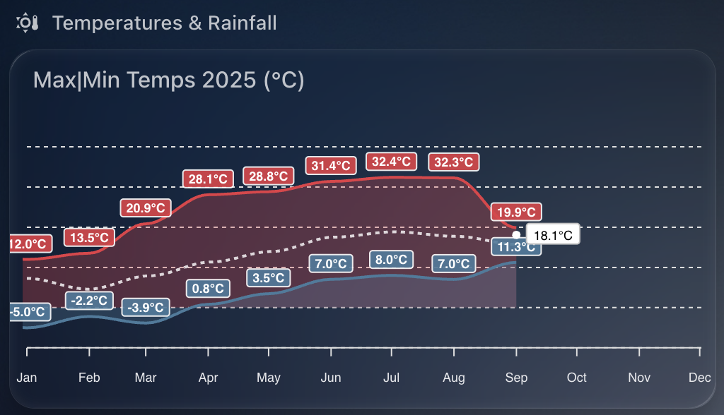
    The chart provides a fantastic visual snapshot of temperature trends throughout the year and uses the excellent apexcharts-card combined with config-template-card for dynamic annotations.


    Why I Built This

    I wanted a quick way to compare month-to-month temperatures for 2025 – not just the highs and lows, but also how the average temperatures trend over time. And with the real-time temperature annotated on the chart, it’s easy to see how the current conditions stack up against the year so far.


    What You’ll Need

    Before you start, make sure you have:

    • Home Assistant running with HACS
    • Installed the following custom cards via HACS:
    • A temperature sensor that reports regularly (e.g., sensor.tempest_temperature in my case)

    How Monthly Max, Min, and Average Temperatures Work

    The magic behind this chart lies in the use of Home Assistant’s built-in long-term statistics capability, which powers the statistics: feature of apexcharts-card.

    Each series uses the following:

    • type: max and type: min with period: month to extract monthly maximum and minimum temperatures respectively
    • type: mean along with group_by.func: avg to generate a monthly average line (in white)

    This means you’re not visualising raw sensor data points, but summarised monthly metrics – ideal for year-on-year comparisons or spotting unusual weather patterns.

    You can control how values are aggregated using align: start or align: end, which defines where in the month each value is anchored on the timeline.


    How the Live Annotation Works

    This chart includes a live annotation showing the current temperature as a small dot with a label.

    This is done using the annotations: section of ApexCharts, made dynamic by wrapping the entire card in a config-template-card.

    Here’s what happens:

    • We define datenow using JavaScript to get the timestamp for the first day of the current month
    • We read the current value from the sensor (sensor.tempest_temperature) using states[...]
    • We format that value to one decimal place and append the unit (°C)
    • These variables (${datenow}, ${temp}, ${tempString}) are injected into the chart’s annotations dynamically

    Without config-template-card, you couldn’t do this interpolation – it’s what allows us to reference JavaScript and Home Assistant state directly within the card definition.


    Customising the X-Axis Labels

    A small detail, but one that makes a big visual difference: the X-axis month labels are rotated and styled for clarity.

    xaxis:
      labels:
        rotate: 90
        style:
          fontSize: 9
        format: MMM

    This does three things:

    1. Rotates the labels so they don’t overlap
    2. Uses short month format (e.g. Jan, Feb, Mar) for a cleaner look
    3. Applies smaller font size to avoid clutter

    This is particularly useful when plotting an entire year, where 12 data points can otherwise get cramped.


    YAML Configuration

    Below is the full YAML you can drop into your dashboard. I used sensor.tempest_temperature as the data source, but you can replace it with any temperature sensor you have.

    type: custom:config-template-card
    variables:
      datenow: new Date(new Date().getFullYear(), new Date().getMonth(), 1).getTime()
      temp: parseFloat(states["sensor.tempest_temperature"].state)
      tempString: >-
        parseFloat(states["sensor.tempest_temperature"].state).toFixed(1) +
        states["sensor.tempest_temperature"].attributes.unit_of_measurement
    entities:
      - sensor.tempest_temperature
    card:
      type: custom:apexcharts-card
      update_interval: 30m
      graph_span: 11month
      span:
        start: year
      header:
        show: true
        title: Max|Min Temps 2025 (°C)
      now:
        show: false
      series:
        - entity: sensor.tempest_temperature
          name: Max Temp
          type: area
          color: "#e63946"
          opacity: 0.3
          float_precision: 1
          show:
            datalabels: true
          statistics:
            type: max
            period: month
            align: start
          extend_to: false
    
        - entity: sensor.tempest_temperature
          name: Min Temp
          type: area
          color: "#457b9d"
          opacity: 0.3
          float_precision: 1
          show:
            datalabels: true
          statistics:
            type: min
            period: month
            align: start
          extend_to: false
    
        - entity: sensor.tempest_temperature
          name: Avg Temp
          type: line
          color: "#ffffff"
          stroke_dash: 3
          float_precision: 1
          opacity: 0.8
          show:
            datalabels: false
          group_by:
            func: avg
            duration: 1month
            fill: zero
          statistics:
            type: mean
            period: month
            align: end
          extend_to: false
    
      apex_config:
        chart:
          height: 200px
        legend:
          show: false
        tooltip:
          enabled: false
        stroke:
          width: 2
        dataLabels:
          offsetY: -5
          style:
            fontSize: 9px
          formatter: |
            EVAL:function(val, opts) {
              return val.toFixed(1) + "°C";
            }
        xaxis:
          labels:
            hideOverlappingLabels: false
            rotate: 90
            show: true
            style:
              fontSize: 9
            format: MMM
        yaxis:
          show: false
        annotations:
          points:
            - x: ${datenow}
              y: ${temp}
              marker:
                size: 2
                shape: circle
                fillColor: "#FFFFFF"
                strokeColor: "#FFFFFF"
              label:
                offsetX: 26
                offsetY: 11
                text: ${tempString}
                style:
                  fontSize: 9
                  color: "#000000"

    Final Thoughts

    This kind of chart makes your Home Assistant dashboard much more informative. With a little templating and the power of ApexCharts, you can surface meaningful trends without needing to dive into graphs or statistics manually.

    The addition of dynamic annotations, paired with Home Assistant’s native statistics engine, creates a beautiful and functional visual that updates automatically.

  • Using WeatherFlow Tempest to Warm My Tesla for the School Run

    As a parent juggling the school run every morning, there’s one thing I really don’t enjoy – scraping ice off the car while trying to wrangle two teenagers and get out the door on time. So I’ve automated the process of pre-heating and defrosting my Tesla using my WeatherFlow Tempest weather station and Home Assistant.

    Tesla being heated

    WeatherFlow Tempest is a smart weather station that gives me highly accurate outdoor temperature data from my own garden. More accurate, in fact, than the Tesla’s own temperature sensors when the car is asleep.

    I use the Tessie integration in Home Assistant to communicate with my car. It allows me to send commands like “turn on climate control” even when the Tesla is sleeping, without the delay or failure that sometimes occurs with the native Tesla integration.


    Why Use Tempest Instead of Tesla’s Own Temperature Reading?

    Tesla goes into a deep sleep mode overnight to conserve energy. That’s great for battery life, but not so great if you want reliable temperature data in the early morning. The external temperature reported by the car can be outdated or missing altogether until the car is awake and responsive.

    Instead, I rely on my WeatherFlow Tempest’s temperature sensor, which continues to report accurate live data overnight.


    The Automation Setup

    Every weekday morning at exactly 8.00am, my Home Assistant instance checks the current outside temperature reported by the Tempest. If it’s below 3°C, the automation triggers Tessie to enable climate control in the car for 15 minutes – enough to warm the cabin and defrost the windows. I also make sure I only set this on school days.

    I also receive a notification letting me know that the defrost has been enabled.

    Here’s the automation in full:

    alias: Warm Car Automation
    description: At 08.00 every school day check outside temp and defrost if below 3C
    mode: single
    triggers:
      - at: "08:00:00"
        platform: time
    conditions:
      - condition: time
        weekday:
          - mon
          - tue
          - wed
          - thu
          - fri
      - condition: numeric_state
        entity_id: sensor.tempest_temperature
        below: 3
    actions:
      - service: climate.turn_on
        target:
          entity_id: climate.none_climate
      - service: notify.notify
        data:
          message: "Car Defrost Enabled for 15 mins"
      - service: notify.persistent_notification
        data:
          title: "Car Defrost Enabled"
          message: "Car Defrost Enabled for 15 mins"

    You can take this further by:

    • Tracking how often the automation is triggered using a counter or helper.
    • Adding a secondary check for battery level to avoid defrosting if your range is low.
    • Turning the climate off again after a set duration (or allowing Tesla’s own timeout to do it for you).

    This small quality-of-life improvement saves me time and hassle every winter morning, and it’s yet another example of how Home Assistant can bring together multiple smart devices into a seamless routine.

  • Monitoring Predbat Plan Generation Times in Home Assistant

    Predbat from springfall2008 is a fantastic custom integration for Home Assistant that intelligently manages solar battery charging and discharging based on predicted solar generation and energy tariffs. It’s especially helpful for optimising when to charge from the grid or discharge to avoid peak tariffs, and it’s saved me a decent amount on my energy bill.

    chart showing predbat on times

    But like any planning tool, Predbat needs time to generate its plan. Most of the time it does this quickly – but occasionally it can take a little longer. I wanted a way to visualise and track how long Predbat was taking to generate its plan each time it ran.

    Why track Predbat’s ON time?

    The provided switch.predbat_active entity goes into the on state when Predbat is generating a new plan. Once complete, it switches back to off. By measuring how long it remains ON, I can catch cases where Predbat is taking longer than expected.

    If it ever takes more than 5 minutes, I want to know – either through a notification or visually via my dashboard.

    Step 1: Creating the Sensor

    I used a trigger-based template sensor that calculates the duration in minutes that the switch.predbat_active was ON.

    Here’s the YAML for the sensor:

    - trigger:
        - platform: state
          entity_id: switch.predbat_active
          from: 'on'
          to: 'off'
      sensor:
        - name: Predbat Last ON Duration
          unique_id: predbat_last_on_duration
          state: >
            {{ (as_timestamp(now()) - as_timestamp(trigger.from_state.last_changed)) / 60 }}
          unit_of_measurement: "minutes"
          icon: mdi:timer

    This sensor will only update when the switch turns OFF. It records how many minutes it was ON – which is effectively how long Predbat took to generate its plan.

    Step 2: Visualising ON Durations in ApexCharts

    To make this information more useful, I plotted it using the excellent ApexCharts card for Home Assistant.

    Here’s the chart YAML I used:

    type: custom:apexcharts-card
    graph_span: 24h
    header:
      show: true
      title: Predbat ON Durations
      show_states: true
      colorize_states: true
    series:
      - entity: sensor.predbat_last_on_duration
        type: column
    apex_config:
      yaxis:
        min: 0
        max: 6
      annotations:
        yaxis:
          - "y": 5
            borderColor: "#FF0000"
            strokeDashArray: 1

    This renders a neat column chart of how long each plan generation took. The red annotation line at 5 minutes gives a clear visual cue if something is taking too long.

    Notifications and Automations

    Now that we have this entity, its a simple job to create a notification if the ON time is longer than my desired 5 minutes. Just use the new entity to trigger a notification to home assistant or your mobile device.