Category: Weather

  • Template Sensor and Attribute issues in Home Assistant

    I came across an interesting issue today and thought it worth documenting.

    I have setup a template sensor which is triggered by the state change of an entity. This template sensor saves a generic state (a string saying OK), storing a maximum or minimum value of the referenced entity as an attribute. Its a daily maximum, so I reset it at midnight.

    Screenshot 2025-09-04 at 13.40.11

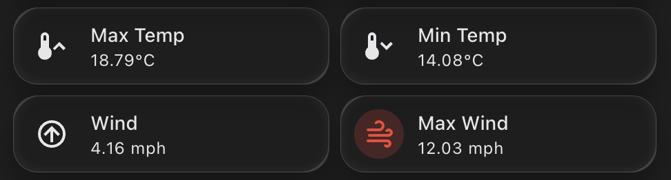
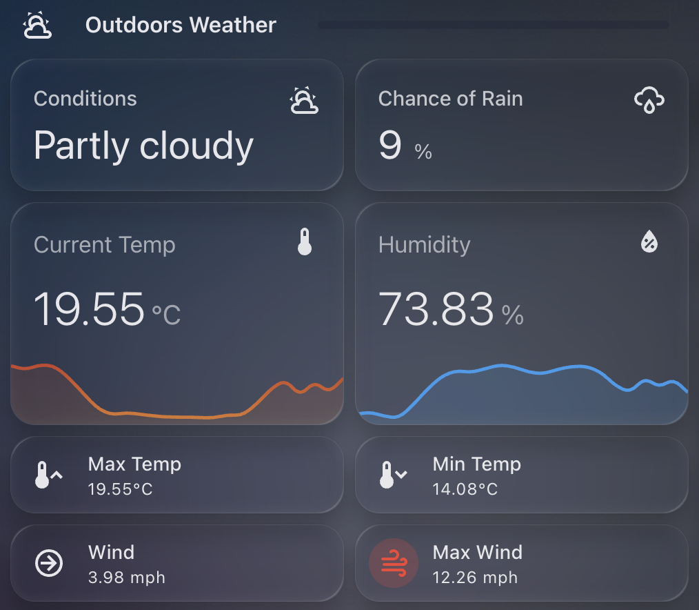
    Template Sensor Setup

    In order to calculate if for example the "new" state of the entity was higher than the previous maximum value stored in the attribute, I have this logic in the template sensor YAML:

    attributes:
        max_rain: >
            {% set r_new = states('sensor.tempest_precipitation_intensity') | float(-1) %}
            {% set prev = this.attributes.max_rain | float(-1) %}
            {{ [r_new, prev] | max if trigger.platform != 'time' else r_new }} 

    So, create a variable r_new of the current state of the precipitation intensity entity, otherwise return -1.

    Next, set a variable prev to get the previous value of the current template sensor attribute (max_rain), otherwise return -1.

    Finally set the max_rain attribute to the largest of the two variables (r_new or prev), or reset to the current state (r_new) at midnight.

    The Problem

    If you test out this YAML logic in the developer tools, it works without error. E.g.

    {% set r_new = states('sensor.tempest_precipitation_intensity') | float(-1) %}
    {% set prev = state_attr('sensor.today_weather_statistics', 'max_rain') | float(-1) %}
    {{ [r_new, prev] | max }}
    Screenshot 2025-09-04 at 13.27.27
    Screenshot 2025-09-04 at 13.27.35

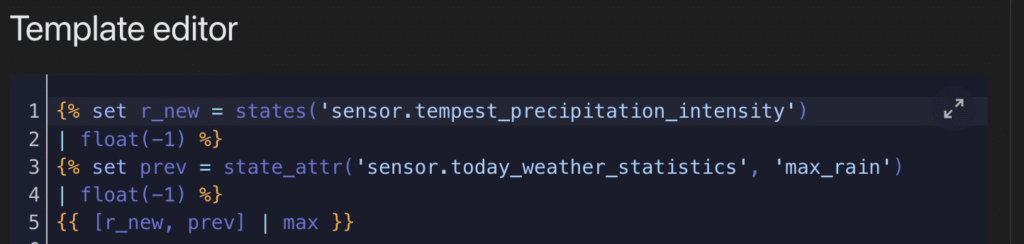
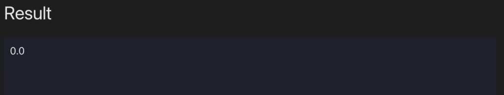
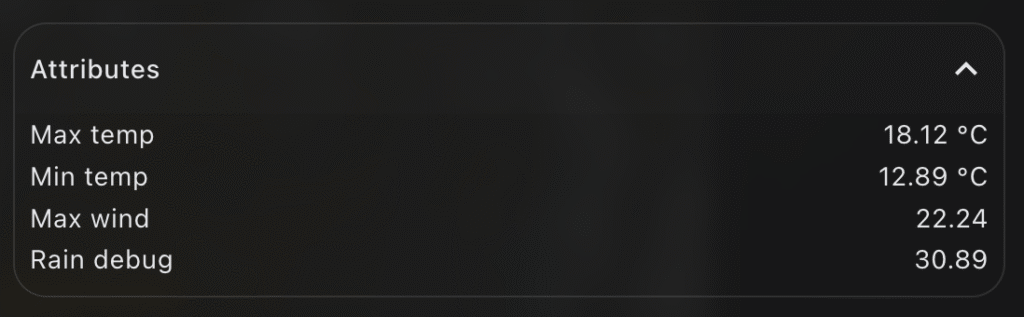
    The result here is 0.0, which reflects the current state from sensor.tempest_precipitation_intensity. In this case prev is returning -1 because the attribute max_rain does not exist on sensor.today_weather_statistics. All expected so far.

    The REAL problem

    The issue comes in when we’re trying to create this template sensor for the first time and establish the max_rain attribute. Because the logic to create and update the max_rain attribute references itself, something internally seems to fail. This all happens despite the YAML being safe in the developer tools. E.g.

    {% set prev = state_attr('sensor.today_weather_statistics', 'max_rain') | float(-1) %}

    Returns -1 safely in the developer tools. But it seems this kind of reference to itself cannot work on the first initialisation of the attribute itself. What you’ll find is the attribute never appears in your template sensor.

    Solution

    So instead of creating the self referencing logic in the first place, the easiest thing to do is something like this, where you create the attribute and assign a default value:

    - trigger:
      - platform: state
        entity_id: 
            - sensor.tempest_precipitation_intensity
      - platform: time
        at: "00:00:00"
      sensor:
        - name: 'Today Weather Statistics'
          unique_id: today_weather_statistics
          state: "OK"
          attributes:
            max_rain: >
                {{ float(0.0) }}

    Restart Home Assistant, go check out your new sensor, and confirm the max_rain attribute appears, with a value of 0.0.

    Now you’re ready for the self-referencing logic to work and not fail. Go back to your template sensor YAML, and update the max_rain logic:

    - trigger:
      - platform: state
        entity_id: 
            - sensor.tempest_precipitation_intensity
      - platform: time
        at: "00:00:00"
      sensor:
        - name: 'Today Weather Statistics'
          unique_id: today_weather_statistics
          state: "OK"
          attributes:
            max_rain: >
                        {% set r_new = states('sensor.tempest_precipitation_intensity') | float(-1) %}
                        {% set prev = this.attributes.max_rain | float(-1) %}
                        {{ [r_new, prev] | max if trigger.platform != 'time' else r_new }} 

    Restart Home Assistant – this time you should still see your attribute, but most importantly, see the value increase from 0.0, should the state of your reference entity be higher.

  • Capturing Min / Max Weather values in a Home Assistant Entity

    Tracking daily weather extremes in Home Assistant can be a really useful addition to your dashboard, especially if you’re keen to understand trends over time or highlight key information visually.

    Screenshot 2025-09-01 at 11.29.31

    In my case, I wanted a lightweight, efficient way to display the maximum temperature, minimum temperature, and maximum wind speed recorded during the day. Not only does this create a simple historical snapshot, but it also enables me to power Mushroom Template Cards with rich attribute data, without needing to rely on external integrations or long-term statistics.

    The Template Sensor

    Here’s the YAML I used to create a template sensor that records today’s key weather stats. This sensor uses a combination of state and time-based triggers to reset at midnight and accumulate data throughout the day.

    - trigger:
        - platform: state
          entity_id: 
            - sensor.tempest_temperature
            - sensor.tempest_wind_speed
        - platform: time
          at: "00:00:00"
      sensor:
        - name: 'Today Weather Statistics'
          unique_id: today_weather_statistics
          state: "OK"
          attributes:
            max_temp: >
              {% set t_new = states('sensor.tempest_temperature') | float(-99) %}
              {% set prev = this.attributes.max_temp | float(-99) %}
              {{ [t_new, prev] | max if trigger.platform != 'time' else t_new }}
            min_temp: >
              {% set t_new = states('sensor.tempest_temperature') | float(99) %}
              {% set prev = this.attributes.min_temp | float(99) %}
              {{ [t_new, prev] | min if trigger.platform != 'time' else t_new }}
            max_wind: >
              {% set w_new = states('sensor.tempest_wind_speed') | float(-1) %}
              {% set prev = this.attributes.max_wind | float(-1) %}
              {{ [w_new, prev] | max if trigger.platform != 'time' else w_new }}

    How it works

    • State triggers respond to changes in sensor.tempest_temperature and sensor.tempest_wind_speed. Every time they update, the template checks if the new value exceeds (or undercuts) the previous attribute value and stores the result.
    • Midnight reset is achieved via a time-based trigger at 00:00:00. At this point, the values reset to the current readings (effectively seeding the day).
    • The state is set to "OK" as a placeholder—it’s not used for charting or display, but helps avoid null states.

    Home Assistant issues with adding new attributes

    I found (randomly it seems not predictably) that some of the new attributes would not be created on their first load, once I restarted Home Assistant. It was very frustrating to debug, the logic is to set a variable from a entity state, or otherwise set a float – but something is failing. If you too are finding that the attribute isnt appearing, instead – establish the attribute more simply with a default value. Restart HA and confirm the attribute now shows up. E.g.

            max_wind: >
              {{ float(0) }}

    This creates the new max_wind attribute with a default value of 0.0. Now update your YAML per the above with the logic to capture the maximum wind speed, this time it should update without issue.

    Using This Sensor in Mushroom Cards

    Now that the max and min values are stored in the attributes, you can easily access them in mushroom-template-card components. Here’s an example that shows the max temperature for today:

    - type: custom:mushroom-template-card
      primary: "Max Temp"
      secondary: >
        {{ state_attr('sensor.today_weather_statistics', 'max_temp') | round(1) }}°C
      icon: mdi:thermometer-high

    Or for minimum temperature:

    - type: custom:mushroom-template-card
      primary: "Min Temp"
      secondary: >
        {{ state_attr('sensor.today_weather_statistics', 'min_temp') | round(1) }}°C
      icon: mdi:thermometer-low

    And similarly for wind:

    - type: custom:mushroom-template-card
      primary: "Max Wind"
      secondary: >
        {{ state_attr('sensor.today_weather_statistics', 'max_wind') | round(1) }} mph
      icon: mdi:weather-windy

    Why I Like This Approach

    • It’s simple and fast. No need to use mulitple sensors or long-term statistics.
    • It works entirely in real-time, using native templating.
    • It powers lightweight dashboard cards with just the information I want to see.
    • It’s resettable and predictable – every day starts clean at midnight.
  • Adding Weather Forecast to the Predbat Table Card in Home Assistant

    Predbat is brilliant at building smart charging and discharging plans for my home battery system, based on real-time energy costs, predicted house load, and solar forecasts. It uses Solcast data to predict generation and works out the best times to import, export, or hold energy.

    predbat table card weather columns

    But while Solcast takes weather into account when generating its solar forecast, I often found myself wondering why a particular slot was being scheduled a certain way. Was it cloudy? Raining? Very hot? All of these could affect either solar production or battery efficiency.

    That’s when I decided to bring weather information directly into the Predbat Table Card.

    Why Add Weather to the Table?

    Although Predbat itself does not use the weather entity directly, it’s still useful to overlay forecast conditions with the battery plan. This extra context helps me better understand why certain slots are heavy on import or export, especially when the solar forecast looks optimistic but the weather conditions are less than ideal.

    By seeing temperature, cloud cover, or rain in each 30-minute slot, I can cross-reference the charging plan with real-world weather, and make sense of some edge-case decisions.

    How the Integration Works

    The Predbat Table Card supports optional weather and temperature columns through two features I added:

    • weather-column: shows a weather icon for the slot
    • temp-column: shows the predicted temperature
    • rain-column: shows the predicted chance of rain

    To enable them, you need a valid forecast-capable weather entity in Home Assistant and to define it using weather_entity.

    Example Configuration

    Here’s how I set it up in my YAML:

    type: custom:predbat-table-card
    title: Predbat Plan with Weather
    weather_entity: weather.forecast_home
    columns:
      - time-column
      - weather-column
      - temp-column
        - rain-column
      - import-column
      - state-column

    You can of course rearrange or add more columns like export-column, load-column, or soc-column etc as needed.

    Notes on Forecast Compatibility

    This feature only works with forecast-style weather entities that follow the Home Assistant spec. Tested working examples include:

    • weather.met_home (from Met.no)
    • weather.weatherflow_forecast (from the WeatherFlow integration)
    • weather.met_office_yourlocation (from the Met Office weather integration)

    If the weather forecast does not cover the full duration of the Predbat plan (e.g. forecast ends before the plan does), then no weather icon or temperature will show for those slots.

    Colour-Coding and Hover Details

    To quickly spot critical conditions, the table applies colour coding:

    • Red: temperature over 25°C – which could reduce solar panel efficiency
    • Blue: temperature below 0°C – which could reduce battery efficiency

    Each icon also supports mouse-over tooltips, where you can view the detailed weather condition and temperature value.


    If you want to try this yourself, grab the latest version of Predbat Table Card and follow the weather column documentation.

  • Building a Min-Max-Avg Temperature Chart in Home Assistant

    This guide walks you through how I created a clean, monthly temperature overview card in Home Assistant, showing maximum, minimum, and average temperatures across the year – with a live annotation for the current reading.

    Chart showing monthly temperatures for my location

    The chart provides a fantastic visual snapshot of temperature trends throughout the year and uses the excellent apexcharts-card combined with config-template-card for dynamic annotations.


    Why I Built This

    I wanted a quick way to compare month-to-month temperatures for 2025 – not just the highs and lows, but also how the average temperatures trend over time. And with the real-time temperature annotated on the chart, it’s easy to see how the current conditions stack up against the year so far.


    What You’ll Need

    Before you start, make sure you have:

    • Home Assistant running with HACS
    • Installed the following custom cards via HACS:
    • A temperature sensor that reports regularly (e.g., sensor.tempest_temperature in my case)

    How Monthly Max, Min, and Average Temperatures Work

    The magic behind this chart lies in the use of Home Assistant’s built-in long-term statistics capability, which powers the statistics: feature of apexcharts-card.

    Each series uses the following:

    • type: max and type: min with period: month to extract monthly maximum and minimum temperatures respectively
    • type: mean along with group_by.func: avg to generate a monthly average line (in white)

    This means you’re not visualising raw sensor data points, but summarised monthly metrics – ideal for year-on-year comparisons or spotting unusual weather patterns.

    You can control how values are aggregated using align: start or align: end, which defines where in the month each value is anchored on the timeline.


    How the Live Annotation Works

    This chart includes a live annotation showing the current temperature as a small dot with a label.

    This is done using the annotations: section of ApexCharts, made dynamic by wrapping the entire card in a config-template-card.

    Here’s what happens:

    • We define datenow using JavaScript to get the timestamp for the first day of the current month
    • We read the current value from the sensor (sensor.tempest_temperature) using states[...]
    • We format that value to one decimal place and append the unit (°C)
    • These variables (${datenow}, ${temp}, ${tempString}) are injected into the chart’s annotations dynamically

    Without config-template-card, you couldn’t do this interpolation – it’s what allows us to reference JavaScript and Home Assistant state directly within the card definition.


    Customising the X-Axis Labels

    A small detail, but one that makes a big visual difference: the X-axis month labels are rotated and styled for clarity.

    xaxis:
      labels:
        rotate: 90
        style:
          fontSize: 9
        format: MMM

    This does three things:

    1. Rotates the labels so they don’t overlap
    2. Uses short month format (e.g. Jan, Feb, Mar) for a cleaner look
    3. Applies smaller font size to avoid clutter

    This is particularly useful when plotting an entire year, where 12 data points can otherwise get cramped.


    YAML Configuration

    Below is the full YAML you can drop into your dashboard. I used sensor.tempest_temperature as the data source, but you can replace it with any temperature sensor you have.

    type: custom:config-template-card
    variables:
      datenow: new Date(new Date().getFullYear(), new Date().getMonth(), 1).getTime()
      temp: parseFloat(states["sensor.tempest_temperature"].state)
      tempString: >-
        parseFloat(states["sensor.tempest_temperature"].state).toFixed(1) +
        states["sensor.tempest_temperature"].attributes.unit_of_measurement
    entities:
      - sensor.tempest_temperature
    card:
      type: custom:apexcharts-card
      update_interval: 30m
      graph_span: 11month
      span:
        start: year
      header:
        show: true
        title: Max|Min Temps 2025 (°C)
      now:
        show: false
      series:
        - entity: sensor.tempest_temperature
          name: Max Temp
          type: area
          color: "#e63946"
          opacity: 0.3
          float_precision: 1
          show:
            datalabels: true
          statistics:
            type: max
            period: month
            align: start
          extend_to: false
    
        - entity: sensor.tempest_temperature
          name: Min Temp
          type: area
          color: "#457b9d"
          opacity: 0.3
          float_precision: 1
          show:
            datalabels: true
          statistics:
            type: min
            period: month
            align: start
          extend_to: false
    
        - entity: sensor.tempest_temperature
          name: Avg Temp
          type: line
          color: "#ffffff"
          stroke_dash: 3
          float_precision: 1
          opacity: 0.8
          show:
            datalabels: false
          group_by:
            func: avg
            duration: 1month
            fill: zero
          statistics:
            type: mean
            period: month
            align: end
          extend_to: false
    
      apex_config:
        chart:
          height: 200px
        legend:
          show: false
        tooltip:
          enabled: false
        stroke:
          width: 2
        dataLabels:
          offsetY: -5
          style:
            fontSize: 9px
          formatter: |
            EVAL:function(val, opts) {
              return val.toFixed(1) + "°C";
            }
        xaxis:
          labels:
            hideOverlappingLabels: false
            rotate: 90
            show: true
            style:
              fontSize: 9
            format: MMM
        yaxis:
          show: false
        annotations:
          points:
            - x: ${datenow}
              y: ${temp}
              marker:
                size: 2
                shape: circle
                fillColor: "#FFFFFF"
                strokeColor: "#FFFFFF"
              label:
                offsetX: 26
                offsetY: 11
                text: ${tempString}
                style:
                  fontSize: 9
                  color: "#000000"

    Final Thoughts

    This kind of chart makes your Home Assistant dashboard much more informative. With a little templating and the power of ApexCharts, you can surface meaningful trends without needing to dive into graphs or statistics manually.

    The addition of dynamic annotations, paired with Home Assistant’s native statistics engine, creates a beautiful and functional visual that updates automatically.

  • Using WeatherFlow Tempest to Warm My Tesla for the School Run

    As a parent juggling the school run every morning, there’s one thing I really don’t enjoy – scraping ice off the car while trying to wrangle two teenagers and get out the door on time. So I’ve automated the process of pre-heating and defrosting my Tesla using my WeatherFlow Tempest weather station and Home Assistant.

    Tesla being heated

    WeatherFlow Tempest is a smart weather station that gives me highly accurate outdoor temperature data from my own garden. More accurate, in fact, than the Tesla’s own temperature sensors when the car is asleep.

    I use the Tessie integration in Home Assistant to communicate with my car. It allows me to send commands like “turn on climate control” even when the Tesla is sleeping, without the delay or failure that sometimes occurs with the native Tesla integration.


    Why Use Tempest Instead of Tesla’s Own Temperature Reading?

    Tesla goes into a deep sleep mode overnight to conserve energy. That’s great for battery life, but not so great if you want reliable temperature data in the early morning. The external temperature reported by the car can be outdated or missing altogether until the car is awake and responsive.

    Instead, I rely on my WeatherFlow Tempest’s temperature sensor, which continues to report accurate live data overnight.


    The Automation Setup

    Every weekday morning at exactly 8.00am, my Home Assistant instance checks the current outside temperature reported by the Tempest. If it’s below 3°C, the automation triggers Tessie to enable climate control in the car for 15 minutes – enough to warm the cabin and defrost the windows. I also make sure I only set this on school days.

    I also receive a notification letting me know that the defrost has been enabled.

    Here’s the automation in full:

    alias: Warm Car Automation
    description: At 08.00 every school day check outside temp and defrost if below 3C
    mode: single
    triggers:
      - at: "08:00:00"
        platform: time
    conditions:
      - condition: time
        weekday:
          - mon
          - tue
          - wed
          - thu
          - fri
      - condition: numeric_state
        entity_id: sensor.tempest_temperature
        below: 3
    actions:
      - service: climate.turn_on
        target:
          entity_id: climate.none_climate
      - service: notify.notify
        data:
          message: "Car Defrost Enabled for 15 mins"
      - service: notify.persistent_notification
        data:
          title: "Car Defrost Enabled"
          message: "Car Defrost Enabled for 15 mins"

    You can take this further by:

    • Tracking how often the automation is triggered using a counter or helper.
    • Adding a secondary check for battery level to avoid defrosting if your range is low.
    • Turning the climate off again after a set duration (or allowing Tesla’s own timeout to do it for you).

    This small quality-of-life improvement saves me time and hassle every winter morning, and it’s yet another example of how Home Assistant can bring together multiple smart devices into a seamless routine.

  • Accessing UK Rainfall Data in Home Assistant with the Environment Agency’s Beta API

    If you’re looking to add real-time UK rainfall data to your Home Assistant setup, the Environment Agency (EA) offers a beta API that exposes official rain gauge readings from across England. This post explains how to access that data, find your nearest measurement station, and integrate it into Home Assistant using a REST sensor.

    dashboard image from home assistant showing a rain sensor

    What Is the EA Rainfall API?

    The EA’s Flood Monitoring API includes rainfall measurements from hundreds of monitoring stations across the UK. You can query specific stations to retrieve rainfall data from the past 24 hours.

    Note:
    This API is officially in beta, which means it’s not guaranteed to be available 24/7. The service occasionally times out or becomes unresponsive, so any sensors you create may intermittently return "unknown" or fail to update.


    Step 1: Find Your Nearest Rainfall Station

    To begin, you’ll need the station ID of the rainfall monitor closest to your location.

    1. Visit the EA’s monitoring station search page:
      https://check-for-flooding.service.gov.uk/river-and-sea-levels

    2. Use the search bar for your location / home / postcode.

    3. In the results page, choose the Rainfall tab.

    4. Click on a nearby station marker to bring up its detail page. It will look like this:
      https://check-for-flooding.service.gov.uk/rainfall-station/E1234
      The ID at the end (E1234 in this example) is what you’ll use in your sensor configuration.

    5. You can also test live readings using this format:
      https://environment.data.gov.uk/flood-monitoring/id/stations/E1234/readings?parameter=rainfall&today


    Step 2: Add the REST Sensor in Home Assistant

    Once you’ve chosen a suitable station ID, add the following to your Home Assistant configuration.yaml under sensor: (or a new YAML file if using rest: integration directly):

    - platform: rest
      name: Rainfall Today (EA)
      unique_id: rainfall_today_ea
      resource: https://environment.data.gov.uk/flood-monitoring/id/stations/YOUR_STATION_ID/readings?parameter=rainfall&today
      method: GET
      value_template: >
        {% set readings = value_json["items"] | default([]) %}
        {% if readings %}
          {% set total = readings
              | map(attribute='value')
              | map('float')
              | sum %}
          {{ '%.2f' | format(total) }}
        {% else %}
          0.00
        {% endif %}
      unit_of_measurement: mm
      device_class: precipitation
      state_class: total
      scan_interval: 900

    Important: Replace YOUR_STATION_ID with your chosen ID (e.g., E1234).

    Important: Restart Home Assistant to enable the new sensor.


    Step 3: Display on a Dashboard

    Now that the sensor is added, you can display the total rainfall for today using any standard card in Lovelace, using the entity sensor.rainfall_today_ea. You could also combine it with daily or weekly trend charts for deeper insight.


    Troubleshooting Tips

    • If the sensor value shows as "unknown" or doesn’t update, it’s likely due to temporary API downtime.
    • Double-check that the station you’ve chosen reports rainfall and not only water level or flow.
    • You can test the API manually in your browser to confirm it’s returning valid JSON.

    Using the EA’s beta rainfall API is a great way to get highly localised, official rainfall data into your smart home dashboard. While it’s not perfect due to its beta status, it adds valuable environmental awareness to any Home Assistant setup.

    If you’ve found a reliable station near you, this integration can help you:

    • Track rainfall for automation purposes
    • Cross-check rainfall against your garden’s needs
    • Build weather prediction models using historical patterns

    I am also using it to compare to the rainfall totals I get through my Weatherflow Tempest device. It uses haptics to measure rainfall which is not as exact as I hoped. Comparing its results with the official "close by" EA measurement station helped me understand how accurate it really was… in short – its close enough!

  • Building a Hourly Rain Forecast Chart in Home Assistant

    I’ve been playing around with ways to better visualise upcoming rainfall. The main weather integrations in Home Assistant often focus on current conditions or broad daily forecasts, but I wanted something more granular.

    Chart showing hourly rainfall

    Specifically, I wanted to see hourly rainfall predictions for the next 24 hours in a compact, clean, and useful format. Ideal for deciding if I need to bring the washing in or delay watering the garden. Here’s how I set it up.

    Step 1: Create the Input Text Helper (YAML)

    First, we need a place to store the hourly rainfall values. I created a simple input_text helper in configuration.yaml. This holds a JSON string that we can read later in the chart.

    Here’s the code to add:

    input_text:
      hourly_forecast_json:
        name: Hourly Forecast JSON
        initial: ""
        max: 255

    Note: The default limit is 255 characters, which fits roughly 24 hourly values. If you want to expand this for a longer range, you can increase the max value — for example, set max: 1024 for future-proofing.

    Once added, restart Home Assistant to activate the helper.

    Step 2: Pull the Hourly Forecast Data

    Next, I created an automation that fetches the next 24 hours of hourly weather data from my forecast provider. It extracts just the precipitation values and stores them as a JSON array in the helper.

    This runs every 5 minutes to keep the data fresh:

    alias: Update Hourly Forecast
    description: ""
    trigger:
      - platform: time_pattern
        minutes: "/5"
    action:
      - service: weather.get_forecasts
        data:
          type: hourly
        target:
          entity_id: weather.my_forecast_provider
        response_variable: forecast_data
    
      - service: input_text.set_value
        data:
          entity_id: input_text.hourly_forecast_json
          value: >
            {{
              forecast_data['weather.my_forecast_provider'].forecast[:24]
              | map(attribute='precipitation')
              | list
              | to_json
            }}
    mode: single

    This gives you a neat string like [0.0, 0.2, 0.4, 0.0, ...] representing each hour’s predicted rainfall in millimetres.

    Step 3: Display the Chart with ApexCharts

    I wanted the final chart to be small, clean, and focused. Using apexcharts-card, I built a column chart that only shows hours where rain is expected — zeroes are filtered out to reduce clutter.

    Here’s the YAML for the card:

    - type: custom:apexcharts-card
      header:
        title: 24h Precipitation Forecast
        show: true
      graph_span: 24h
      span:
        start: hour
      yaxis:
        - min: 0
          decimals: 2
      series:
        - entity: sun.sun  # dummy entity to enable chart
          name: Rain (mm)
          type: column
          color: rgb(76, 166, 238)
          data_generator: |
            try {
              const raw = hass.states['input_text.hourly_forecast_json']?.state;
              if (!raw || !raw.startsWith("[")) return [];
              const data = JSON.parse(raw);
              if (!Array.isArray(data)) return [];
              const now = new Date();
              now.setMinutes(0, 0, 0);  // align to hour start
              return data.reduce((acc, val, i) => {
                if (val !== 0) {
                  const time = new Date(now.getTime() + i * 3600 * 1000).getTime();
                  acc.push([time, val]);
                }
                return acc;
              }, []);
            } catch (e) {
              console.error("ApexCharts data_generator error:", e);
              return [];
            }
      apex_config:
        chart:
          height: 200px
        tooltip:
          enabled: false
        plotOptions:
          bar:
            columnWidth: 14
            borderRadius: 1
        stroke:
          width: 1
          colors:
            - "#FFFFFF"
        dataLabels:
          offsetY: -10
          style:
            fontSize: 9
        xaxis:
          labels:
            hideOverlappingLabels: false
            rotate: 90
            show: true
            style:
              fontSize: 9
            format: HH
        yaxis:
          show: false
        legend:
          show: false

    This chart gives a very quick heads-up on upcoming rain intensity. Because it only shows hours with rain (zero values are filtered out), it’s minimal and takes up little space. It works well on both mobile and wall-mounted dashboards.

    More importantly, it pulls real hourly forecast data rather than estimates or summaries. You get the precise precipitation expected in millimetres for each hour. Handy if you’re deciding whether to pause a garden irrigation schedule or go out for a walk.

  • A Small but Mighty Wind Card in Home Assistant

    As part of refining my Home Assistant dashboards, I wanted a lightweight, dynamic card to show current wind conditions from my Weatherflow Tempest.

    Screenshot 2025-09-01 at 12.36.38

    There are plenty of ways to visualise weather data, but most are either too large, too basic, or just not very readable. I wanted something compact, clean, and glanceable. A quick read, no fluff, and no wasted screen space.

    This is where the Mushroom Template Card really shines. It’s incredibly flexible, looks modern, and lets you pack a surprising amount of intelligence into a small card.

    What I Wanted

    The goal was simple:

    • Show the wind speed in mph.
    • Display a directional icon based on wind direction.
    • Change the icon colour if wind speed is high.
    • Keep it compact, no charts, no clutter.

    All powered by the Tempest sensors I already had in place.

    The YAML

    Here’s the full YAML I ended up with:

    type: custom:mushroom-template-card
    entity: sensor.tempest_wind_speed
    primary: Wind
    secondary: "{{ states('sensor.tempest_wind_speed') | float | round(2) }} mph"

    The secondary line uses Jinja2 to pull the wind speed and round it to two decimal places. I like that this keeps it readable without unnecessary decimals.

    Directional Icon Logic

    The icon is where it gets a bit more clever. If the wind sensor is reporting a valid direction and the wind isn’t zero, we map it to a directional arrow.

    icon: >-
      {% set raw_dir = states('sensor.tempest_wind_direction') %}
      {% set raw_speed = states('sensor.tempest_wind_speed') %}
      {% if raw_dir in ['unknown', 'unavailable', 'none', ''] or raw_speed | float == 0 %}
        mdi:compass
      {% else %}
        {% set d_from = ((raw_dir | float) % 360 + 360) % 360 %}
        {% set d_to = (d_from + 180) % 360 %}
        {% set idx = (((d_to + 22.5) % 360) // 45) | int %}
        {% set icons = [
          'mdi:arrow-up-circle-outline',
          'mdi:arrow-top-right-thin-circle-outline',
          'mdi:arrow-right-circle-outline',
          'mdi:arrow-bottom-right-thin-circle-outline',
          'mdi:arrow-down-circle-outline',
          'mdi:arrow-bottom-left-thin-circle-outline',
          'mdi:arrow-left-circle-outline',
          'mdi:arrow-top-left-thin-circle-outline'
        ] %}
        {{ icons[idx] }}
      {% endif %}

    Let me break that down:

    • If the direction or speed is unknown or zero, we show a generic compass icon.
    • Otherwise, we:
      • Calculate the direction the wind is going to (not coming from).
      • Convert it into an index between 0–7.
      • Map that to one of eight arrow icons using Material Design Icons (MDI).

    This gives a visual indication of direction without needing to read degrees.

    Icon Colour Based on Wind Speed

    Just for a bit of extra UX, I wanted the icon to go red if the wind is high (10+ mph). Otherwise, it uses the theme’s default colour.

    icon_color: >-
      {% set raw_speed = states('sensor.tempest_wind_speed') | float %}
      {% if raw_speed >= 10 %}
        red
      {% else %}
        "var(text-primary-color)"
      {% endif %}

    This makes it easy to spot when it’s particularly gusty outside without taking up extra space or alerting.

    Final Touch

    Finally, I added a tap action to bring up the more-info panel when you tap the card.

    tap_action:
      action: more-info

    That way, if I want to see the raw data or history graph, it’s just a tap away.

    Result

    What I ended up with is a sleek little wind tile that blends into my dashboard, gives me useful info at a glance, and doesn’t crowd the interface.

    It’s one of those tiny details that makes the whole dashboard feel more alive.

    shows a dashboard of weather widgets, wind, rain, temperature

    Entire YAML

    type: custom:mushroom-template-card
    entity: sensor.tempest_wind_speed
    primary: Wind
    secondary: "{{ states('sensor.tempest_wind_speed') | float | round(2) }} mph"
    icon: >-
      {% set raw_dir = states('sensor.tempest_wind_direction') %}
      {% set raw_speed = states('sensor.tempest_wind_speed') %}
      {% if raw_dir in ['unknown', 'unavailable', 'none', ''] or raw_speed | float == 0 %}
        mdi:compass
      {% else %}
        {% set d_from = ((raw_dir | float) % 360 + 360) % 360 %}
        {% set d_to = (d_from + 180) % 360 %}
        {% set idx = (((d_to + 22.5) % 360) // 45) | int %}
        {% set icons = [
          'mdi:arrow-up-circle-outline',
          'mdi:arrow-top-right-thin-circle-outline',
          'mdi:arrow-right-circle-outline',
          'mdi:arrow-bottom-right-thin-circle-outline',
          'mdi:arrow-down-circle-outline',
          'mdi:arrow-bottom-left-thin-circle-outline',
          'mdi:arrow-left-circle-outline',
          'mdi:arrow-top-left-thin-circle-outline'
        ] %}
        {{ icons[idx] }}
      {% endif %}
    icon_color: >-
      {% set raw_speed = states('sensor.tempest_wind_speed') | float %}
      {% if raw_speed >= 10 %}
        red
      {% else %}
        "var(text-primary-color)"
      {% endif %}
    tap_action:
      action: more-info