Author: pacemaker82

  • Home Assistant Dashboard for Solar PV tracking

    One of the most satisfying parts of running a home solar setup is being able to visualise how your system performs compared to the forecast, how its performing financially, and how might it perform in the next few days.

    home assistant dashboard previewing solar pv

    In this walkthrough I’ll explain at a high level how I’ve combined Solcast, Predbat & Octopus Energy integrations, with Bar Card, Apex Charts and more to get a really great looking dashboard. I’ll do a deeper dive on how its all possible soon.


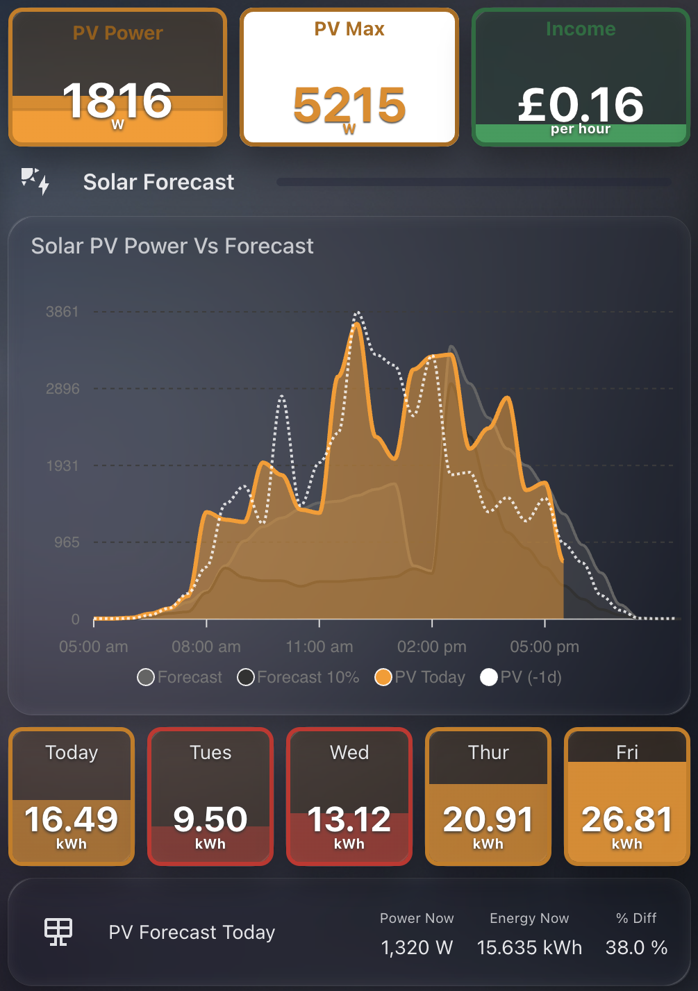
    Live PV Overview Using Bar Card

    Screenshot 2025-09-01 at 17.36.56

    At the top of this section, I use a compact bar-card layout to display:

    • PV Power: current output from my solar inverter
    • PV Max: the peak output so far today
    • Income: estimated real-time value in £/hour based on grid interaction

    These are not standard stat cards. They are styled bar-card elements, which give me better layout control and a consistent visual design.

    The live PV data (including PV Power and Max) comes from my GivEnergy system, using the excellent GivTCP integration. GivTCP is a local MQTT-based integration that makes real-time data from both the GivEnergy battery and inverter available in Home Assistant. It is fast, reliable, and fully local, which is ideal for anyone running GivEnergy hardware.

    The income figure is calculated using a template sensor that combines live import/export power with live tariff rates from the Octopus Energy integration. This gives a real-time estimate of financial benefit, whether from exported power or avoided import during peak rates. It updates every few seconds and is one of the most useful numbers on the dashboard. The bar card also dynamically changes colour, red for import, green for export.


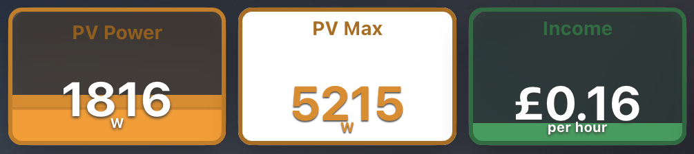
    Solar PV Forecast vs Actual Chart

    Screenshot 2025-09-01 at 17.36.56

    This section is powered by ApexCharts Card and visualises:

    • Solcast Forecast (grey)
    • 10% Confidence Range (dark grey)
    • Actual PV Today (orange)
    • PV from Yesterday (white dotted line)

    It provides a live comparison throughout the day. I can instantly see whether production is tracking above or below expectations, and by how much.

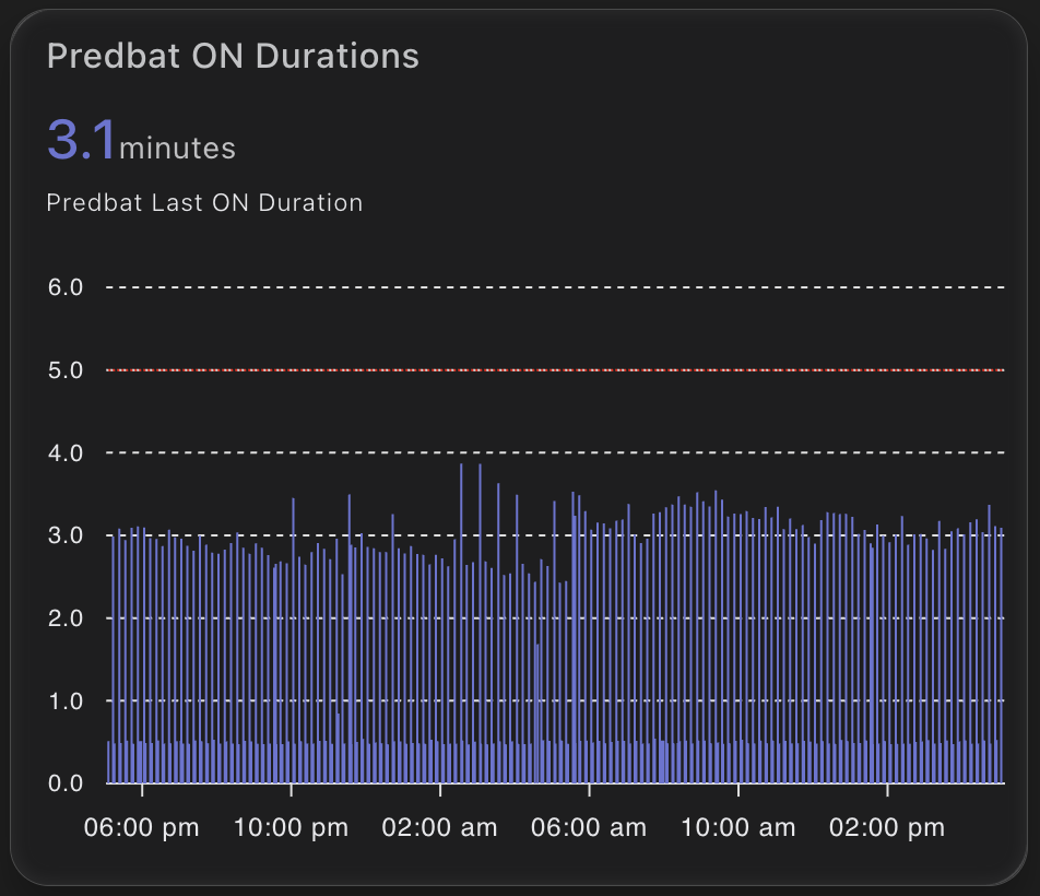
    The forecast data is retrieved via Predbat. Predbat serves as the bridge between Solcast and Home Assistant, pulling in high-resolution forecasts and exposing them as sensors. I then feed these directly into the chart.


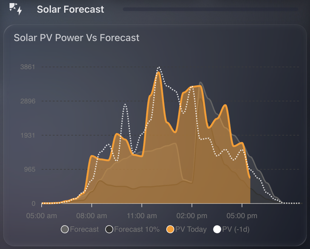
    5-Day Forecast Using Bar Card

    Screenshot 2025-09-01 at 17.36.56

    Just below the chart, I show a 5-day solar forecast using bar-card again. This includes:

    • The Forecast for today and the next 4 days
    • Colour-coded bars based on expected total generation

    Each bar represents total energy (kWh) for the day, with dynamic colouring applied using templates. Lower days show in red, wheras higher days in orange. I’ve configured these in such a way that it uses entities for max PV values (35 kWh in my case) as well as my "threshold" for minimum (around your average use). This enables the dynamic colour coding of the bars.

    If you want to replicate this setup, I’ve created a full walkthrough: PV Card Preview GitHub Repo

    The guide includes:

    • How to access and format forecast data from Predbat
    • Template examples for value display and colour thresholds
    • Complete YAML for the 5-day bar-card layout

    Forecast vs Reality Delta

    Screenshot 2025-09-01 at 17.36.56

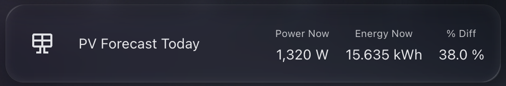
    At the bottom of this section, I include a summary of:

    • Forecasted PV power for right now
    • Forecasted PV energy for right now
    • Percentage difference between the forecast and reality

    For example, as of this image I am 38% up on the forecasted PV energy generation today. These numbers dynamically change as the hours go during the day, giving me a strong signal for how much better or worse reality is compared to the prediction.

  • Monitoring Predbat Plan Generation Times in Home Assistant

    Predbat from springfall2008 is a fantastic custom integration for Home Assistant that intelligently manages solar battery charging and discharging based on predicted solar generation and energy tariffs. It’s especially helpful for optimising when to charge from the grid or discharge to avoid peak tariffs, and it’s saved me a decent amount on my energy bill.

    chart showing predbat on times

    But like any planning tool, Predbat needs time to generate its plan. Most of the time it does this quickly – but occasionally it can take a little longer. I wanted a way to visualise and track how long Predbat was taking to generate its plan each time it ran.

    Why track Predbat’s ON time?

    The provided switch.predbat_active entity goes into the on state when Predbat is generating a new plan. Once complete, it switches back to off. By measuring how long it remains ON, I can catch cases where Predbat is taking longer than expected.

    If it ever takes more than 5 minutes, I want to know – either through a notification or visually via my dashboard.

    Step 1: Creating the Sensor

    I used a trigger-based template sensor that calculates the duration in minutes that the switch.predbat_active was ON.

    Here’s the YAML for the sensor:

    - trigger:
        - platform: state
          entity_id: switch.predbat_active
          from: 'on'
          to: 'off'
      sensor:
        - name: Predbat Last ON Duration
          unique_id: predbat_last_on_duration
          state: >
            {{ (as_timestamp(now()) - as_timestamp(trigger.from_state.last_changed)) / 60 }}
          unit_of_measurement: "minutes"
          icon: mdi:timer

    This sensor will only update when the switch turns OFF. It records how many minutes it was ON – which is effectively how long Predbat took to generate its plan.

    Step 2: Visualising ON Durations in ApexCharts

    To make this information more useful, I plotted it using the excellent ApexCharts card for Home Assistant.

    Here’s the chart YAML I used:

    type: custom:apexcharts-card
    graph_span: 24h
    header:
      show: true
      title: Predbat ON Durations
      show_states: true
      colorize_states: true
    series:
      - entity: sensor.predbat_last_on_duration
        type: column
    apex_config:
      yaxis:
        min: 0
        max: 6
      annotations:
        yaxis:
          - "y": 5
            borderColor: "#FF0000"
            strokeDashArray: 1

    This renders a neat column chart of how long each plan generation took. The red annotation line at 5 minutes gives a clear visual cue if something is taking too long.

    Notifications and Automations

    Now that we have this entity, its a simple job to create a notification if the ON time is longer than my desired 5 minutes. Just use the new entity to trigger a notification to home assistant or your mobile device.

  • Accessing UK Rainfall Data in Home Assistant with the Environment Agency’s Beta API

    If you’re looking to add real-time UK rainfall data to your Home Assistant setup, the Environment Agency (EA) offers a beta API that exposes official rain gauge readings from across England. This post explains how to access that data, find your nearest measurement station, and integrate it into Home Assistant using a REST sensor.

    dashboard image from home assistant showing a rain sensor

    What Is the EA Rainfall API?

    The EA’s Flood Monitoring API includes rainfall measurements from hundreds of monitoring stations across the UK. You can query specific stations to retrieve rainfall data from the past 24 hours.

    Note:
    This API is officially in beta, which means it’s not guaranteed to be available 24/7. The service occasionally times out or becomes unresponsive, so any sensors you create may intermittently return "unknown" or fail to update.


    Step 1: Find Your Nearest Rainfall Station

    To begin, you’ll need the station ID of the rainfall monitor closest to your location.

    1. Visit the EA’s monitoring station search page:
      https://check-for-flooding.service.gov.uk/river-and-sea-levels

    2. Use the search bar for your location / home / postcode.

    3. In the results page, choose the Rainfall tab.

    4. Click on a nearby station marker to bring up its detail page. It will look like this:
      https://check-for-flooding.service.gov.uk/rainfall-station/E1234
      The ID at the end (E1234 in this example) is what you’ll use in your sensor configuration.

    5. You can also test live readings using this format:
      https://environment.data.gov.uk/flood-monitoring/id/stations/E1234/readings?parameter=rainfall&today


    Step 2: Add the REST Sensor in Home Assistant

    Once you’ve chosen a suitable station ID, add the following to your Home Assistant configuration.yaml under sensor: (or a new YAML file if using rest: integration directly):

    - platform: rest
      name: Rainfall Today (EA)
      unique_id: rainfall_today_ea
      resource: https://environment.data.gov.uk/flood-monitoring/id/stations/YOUR_STATION_ID/readings?parameter=rainfall&today
      method: GET
      value_template: >
        {% set readings = value_json["items"] | default([]) %}
        {% if readings %}
          {% set total = readings
              | map(attribute='value')
              | map('float')
              | sum %}
          {{ '%.2f' | format(total) }}
        {% else %}
          0.00
        {% endif %}
      unit_of_measurement: mm
      device_class: precipitation
      state_class: total
      scan_interval: 900

    Important: Replace YOUR_STATION_ID with your chosen ID (e.g., E1234).

    Important: Restart Home Assistant to enable the new sensor.


    Step 3: Display on a Dashboard

    Now that the sensor is added, you can display the total rainfall for today using any standard card in Lovelace, using the entity sensor.rainfall_today_ea. You could also combine it with daily or weekly trend charts for deeper insight.


    Troubleshooting Tips

    • If the sensor value shows as "unknown" or doesn’t update, it’s likely due to temporary API downtime.
    • Double-check that the station you’ve chosen reports rainfall and not only water level or flow.
    • You can test the API manually in your browser to confirm it’s returning valid JSON.

    Using the EA’s beta rainfall API is a great way to get highly localised, official rainfall data into your smart home dashboard. While it’s not perfect due to its beta status, it adds valuable environmental awareness to any Home Assistant setup.

    If you’ve found a reliable station near you, this integration can help you:

    • Track rainfall for automation purposes
    • Cross-check rainfall against your garden’s needs
    • Build weather prediction models using historical patterns

    I am also using it to compare to the rainfall totals I get through my Weatherflow Tempest device. It uses haptics to measure rainfall which is not as exact as I hoped. Comparing its results with the official "close by" EA measurement station helped me understand how accurate it really was… in short – its close enough!

  • Building a Hourly Rain Forecast Chart in Home Assistant

    I’ve been playing around with ways to better visualise upcoming rainfall. The main weather integrations in Home Assistant often focus on current conditions or broad daily forecasts, but I wanted something more granular.

    Chart showing hourly rainfall

    Specifically, I wanted to see hourly rainfall predictions for the next 24 hours in a compact, clean, and useful format. Ideal for deciding if I need to bring the washing in or delay watering the garden. Here’s how I set it up.

    Step 1: Create the Input Text Helper (YAML)

    First, we need a place to store the hourly rainfall values. I created a simple input_text helper in configuration.yaml. This holds a JSON string that we can read later in the chart.

    Here’s the code to add:

    input_text:
      hourly_forecast_json:
        name: Hourly Forecast JSON
        initial: ""
        max: 255

    Note: The default limit is 255 characters, which fits roughly 24 hourly values. If you want to expand this for a longer range, you can increase the max value — for example, set max: 1024 for future-proofing.

    Once added, restart Home Assistant to activate the helper.

    Step 2: Pull the Hourly Forecast Data

    Next, I created an automation that fetches the next 24 hours of hourly weather data from my forecast provider. It extracts just the precipitation values and stores them as a JSON array in the helper.

    This runs every 5 minutes to keep the data fresh:

    alias: Update Hourly Forecast
    description: ""
    trigger:
      - platform: time_pattern
        minutes: "/5"
    action:
      - service: weather.get_forecasts
        data:
          type: hourly
        target:
          entity_id: weather.my_forecast_provider
        response_variable: forecast_data
    
      - service: input_text.set_value
        data:
          entity_id: input_text.hourly_forecast_json
          value: >
            {{
              forecast_data['weather.my_forecast_provider'].forecast[:24]
              | map(attribute='precipitation')
              | list
              | to_json
            }}
    mode: single

    This gives you a neat string like [0.0, 0.2, 0.4, 0.0, ...] representing each hour’s predicted rainfall in millimetres.

    Step 3: Display the Chart with ApexCharts

    I wanted the final chart to be small, clean, and focused. Using apexcharts-card, I built a column chart that only shows hours where rain is expected — zeroes are filtered out to reduce clutter.

    Here’s the YAML for the card:

    - type: custom:apexcharts-card
      header:
        title: 24h Precipitation Forecast
        show: true
      graph_span: 24h
      span:
        start: hour
      yaxis:
        - min: 0
          decimals: 2
      series:
        - entity: sun.sun  # dummy entity to enable chart
          name: Rain (mm)
          type: column
          color: rgb(76, 166, 238)
          data_generator: |
            try {
              const raw = hass.states['input_text.hourly_forecast_json']?.state;
              if (!raw || !raw.startsWith("[")) return [];
              const data = JSON.parse(raw);
              if (!Array.isArray(data)) return [];
              const now = new Date();
              now.setMinutes(0, 0, 0);  // align to hour start
              return data.reduce((acc, val, i) => {
                if (val !== 0) {
                  const time = new Date(now.getTime() + i * 3600 * 1000).getTime();
                  acc.push([time, val]);
                }
                return acc;
              }, []);
            } catch (e) {
              console.error("ApexCharts data_generator error:", e);
              return [];
            }
      apex_config:
        chart:
          height: 200px
        tooltip:
          enabled: false
        plotOptions:
          bar:
            columnWidth: 14
            borderRadius: 1
        stroke:
          width: 1
          colors:
            - "#FFFFFF"
        dataLabels:
          offsetY: -10
          style:
            fontSize: 9
        xaxis:
          labels:
            hideOverlappingLabels: false
            rotate: 90
            show: true
            style:
              fontSize: 9
            format: HH
        yaxis:
          show: false
        legend:
          show: false

    This chart gives a very quick heads-up on upcoming rain intensity. Because it only shows hours with rain (zero values are filtered out), it’s minimal and takes up little space. It works well on both mobile and wall-mounted dashboards.

    More importantly, it pulls real hourly forecast data rather than estimates or summaries. You get the precise precipitation expected in millimetres for each hour. Handy if you’re deciding whether to pause a garden irrigation schedule or go out for a walk.

  • A Small but Mighty Wind Card in Home Assistant

    As part of refining my Home Assistant dashboards, I wanted a lightweight, dynamic card to show current wind conditions from my Weatherflow Tempest.

    Screenshot 2025-09-01 at 12.36.38

    There are plenty of ways to visualise weather data, but most are either too large, too basic, or just not very readable. I wanted something compact, clean, and glanceable. A quick read, no fluff, and no wasted screen space.

    This is where the Mushroom Template Card really shines. It’s incredibly flexible, looks modern, and lets you pack a surprising amount of intelligence into a small card.

    What I Wanted

    The goal was simple:

    • Show the wind speed in mph.
    • Display a directional icon based on wind direction.
    • Change the icon colour if wind speed is high.
    • Keep it compact, no charts, no clutter.

    All powered by the Tempest sensors I already had in place.

    The YAML

    Here’s the full YAML I ended up with:

    type: custom:mushroom-template-card
    entity: sensor.tempest_wind_speed
    primary: Wind
    secondary: "{{ states('sensor.tempest_wind_speed') | float | round(2) }} mph"

    The secondary line uses Jinja2 to pull the wind speed and round it to two decimal places. I like that this keeps it readable without unnecessary decimals.

    Directional Icon Logic

    The icon is where it gets a bit more clever. If the wind sensor is reporting a valid direction and the wind isn’t zero, we map it to a directional arrow.

    icon: >-
      {% set raw_dir = states('sensor.tempest_wind_direction') %}
      {% set raw_speed = states('sensor.tempest_wind_speed') %}
      {% if raw_dir in ['unknown', 'unavailable', 'none', ''] or raw_speed | float == 0 %}
        mdi:compass
      {% else %}
        {% set d_from = ((raw_dir | float) % 360 + 360) % 360 %}
        {% set d_to = (d_from + 180) % 360 %}
        {% set idx = (((d_to + 22.5) % 360) // 45) | int %}
        {% set icons = [
          'mdi:arrow-up-circle-outline',
          'mdi:arrow-top-right-thin-circle-outline',
          'mdi:arrow-right-circle-outline',
          'mdi:arrow-bottom-right-thin-circle-outline',
          'mdi:arrow-down-circle-outline',
          'mdi:arrow-bottom-left-thin-circle-outline',
          'mdi:arrow-left-circle-outline',
          'mdi:arrow-top-left-thin-circle-outline'
        ] %}
        {{ icons[idx] }}
      {% endif %}

    Let me break that down:

    • If the direction or speed is unknown or zero, we show a generic compass icon.
    • Otherwise, we:
      • Calculate the direction the wind is going to (not coming from).
      • Convert it into an index between 0–7.
      • Map that to one of eight arrow icons using Material Design Icons (MDI).

    This gives a visual indication of direction without needing to read degrees.

    Icon Colour Based on Wind Speed

    Just for a bit of extra UX, I wanted the icon to go red if the wind is high (10+ mph). Otherwise, it uses the theme’s default colour.

    icon_color: >-
      {% set raw_speed = states('sensor.tempest_wind_speed') | float %}
      {% if raw_speed >= 10 %}
        red
      {% else %}
        "var(text-primary-color)"
      {% endif %}

    This makes it easy to spot when it’s particularly gusty outside without taking up extra space or alerting.

    Final Touch

    Finally, I added a tap action to bring up the more-info panel when you tap the card.

    tap_action:
      action: more-info

    That way, if I want to see the raw data or history graph, it’s just a tap away.

    Result

    What I ended up with is a sleek little wind tile that blends into my dashboard, gives me useful info at a glance, and doesn’t crowd the interface.

    It’s one of those tiny details that makes the whole dashboard feel more alive.

    shows a dashboard of weather widgets, wind, rain, temperature

    Entire YAML

    type: custom:mushroom-template-card
    entity: sensor.tempest_wind_speed
    primary: Wind
    secondary: "{{ states('sensor.tempest_wind_speed') | float | round(2) }} mph"
    icon: >-
      {% set raw_dir = states('sensor.tempest_wind_direction') %}
      {% set raw_speed = states('sensor.tempest_wind_speed') %}
      {% if raw_dir in ['unknown', 'unavailable', 'none', ''] or raw_speed | float == 0 %}
        mdi:compass
      {% else %}
        {% set d_from = ((raw_dir | float) % 360 + 360) % 360 %}
        {% set d_to = (d_from + 180) % 360 %}
        {% set idx = (((d_to + 22.5) % 360) // 45) | int %}
        {% set icons = [
          'mdi:arrow-up-circle-outline',
          'mdi:arrow-top-right-thin-circle-outline',
          'mdi:arrow-right-circle-outline',
          'mdi:arrow-bottom-right-thin-circle-outline',
          'mdi:arrow-down-circle-outline',
          'mdi:arrow-bottom-left-thin-circle-outline',
          'mdi:arrow-left-circle-outline',
          'mdi:arrow-top-left-thin-circle-outline'
        ] %}
        {{ icons[idx] }}
      {% endif %}
    icon_color: >-
      {% set raw_speed = states('sensor.tempest_wind_speed') | float %}
      {% if raw_speed >= 10 %}
        red
      {% else %}
        "var(text-primary-color)"
      {% endif %}
    tap_action:
      action: more-info