The fallout from this change has been significant, with customers fighting each other, and blaming each other for these changes from Octopus. Abuse of the system being the prime candidate of anger from customers.
While the 6 hour limit of charging doesn’t impact me directly, I think the customer reaction to turn on each other is quite interesting.
In my case, I have a granny (slow) charger for my car. I do about 40 miles a day, needing about 10kWh of charge per day. Because of that, I decided I would not install a fast charger at the cost of £1500, it didnt make financial sense, and still doesn’t. Using IOG I get cheap slots when they grant them, sometimes on peak, mostly off peak. The new 6 hour limit works for me still.
Some customers in this same scenario are doing far more miles than me, and charging for many more hours. This enables their house to also run at the cheap rate. This is the abuse Octopus are trying to target.
Its disheartening to me that the anger of customers is now squared at each other, even if they are non abusers of the system that Octopus themselves put in place. I mentioned I had a slow charger on a thread this week and was quickly piled on, despite not abusing the system and using it per the Octopus terms and conditions of the service.
If Octopus want to stop abuse of slow chargers, then they have the complete control to stop it – just don’t offer the full flexibility of the service to slow chargers. Limit them only. This is 100% in their control to stop.
And customers should stop being angry at each other. If Octopus didnt want abuse of the system in the first place, they could have put rules in place to stop it from the start. They didn’t, or they didn’t enforce it.
After a few weeks of it in place, I wanted to report back on its effectiveness and if its worth your time and money.
Recap on the use-case
My plan was to replace my offline oil tank measuring device to an online measuring device, allowing me to trigger alerts when the tank was low, and for me to be able to monitor and predict when I might need to re-order kerosene. The Shelly BLU Distance seemed to fit that bill, a low energy, battery powered device that could measure the distance between itself and other objects or liquids. It could be installed vertically or horizontally, seemingly perfect for my needs. There are some limitations with the device documented, specifically:
Measurement range: 200 mm – 5000 mm
Accuracy: from 20 cm to 200 cm : +/- 2cm above 200 cm: +/- 1%
Measure interval: Valid range = 5 seconds to 300 seconds. Default – 30 seconds
These seemed fine, I dont need realtime measurement so 5-300 seconds works for me. The accuracy is a little bit of a downer, my tank is 1080mm in height, so a 20mm difference in accuracy is a significant amount of oil, but it was good enough. I installed the device, integrated with home assistant, and off I went.
Immediate impressions
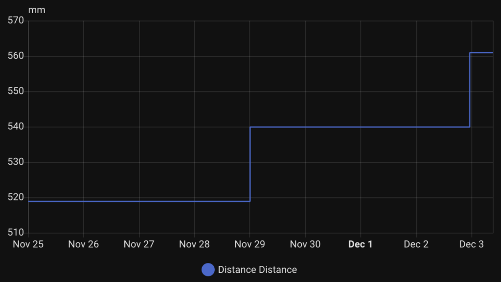
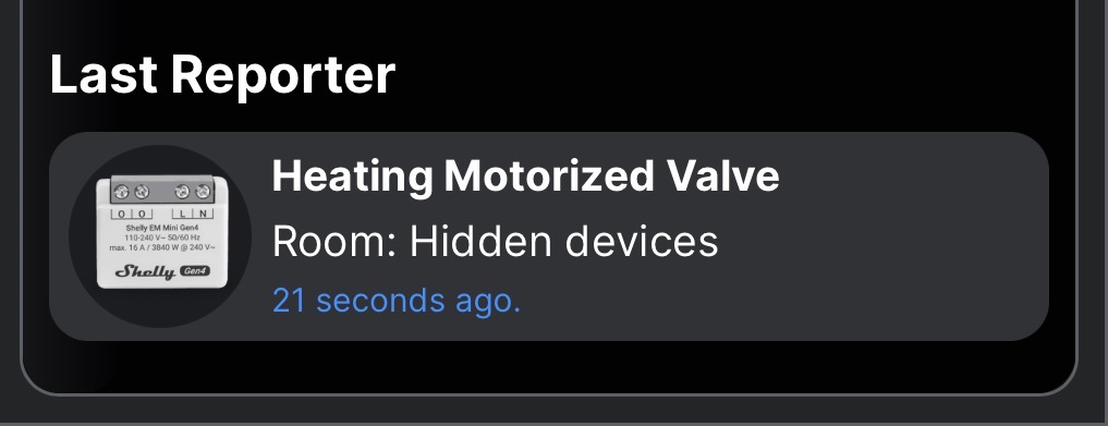
Above is a graph from Home Assistant of the last 8.5 day period, starting with November 25th 2025. What you will immediately see is the rate of change in the readings is very infrequent. This can be confusing in the first hours and days – you are wondering if its a bluetooth signal issue, or something else. I quickly debugged the connectivity, by looking at the Shelly App device page. You will see the "last reporter" which can confirm how long ago a bluetooth gateway device received data from the Distance device:
Screenshot
In my case, it was updating every 30 seconds as I expected – but no change in the mm measured by the device.
So I waited, and waited. Heating oil was being used up (est. 10 litres per day) which was definitely changing the distance of the liquid in the tank from the device, but nothing happened.
Reality of the Shelly BLU Distance
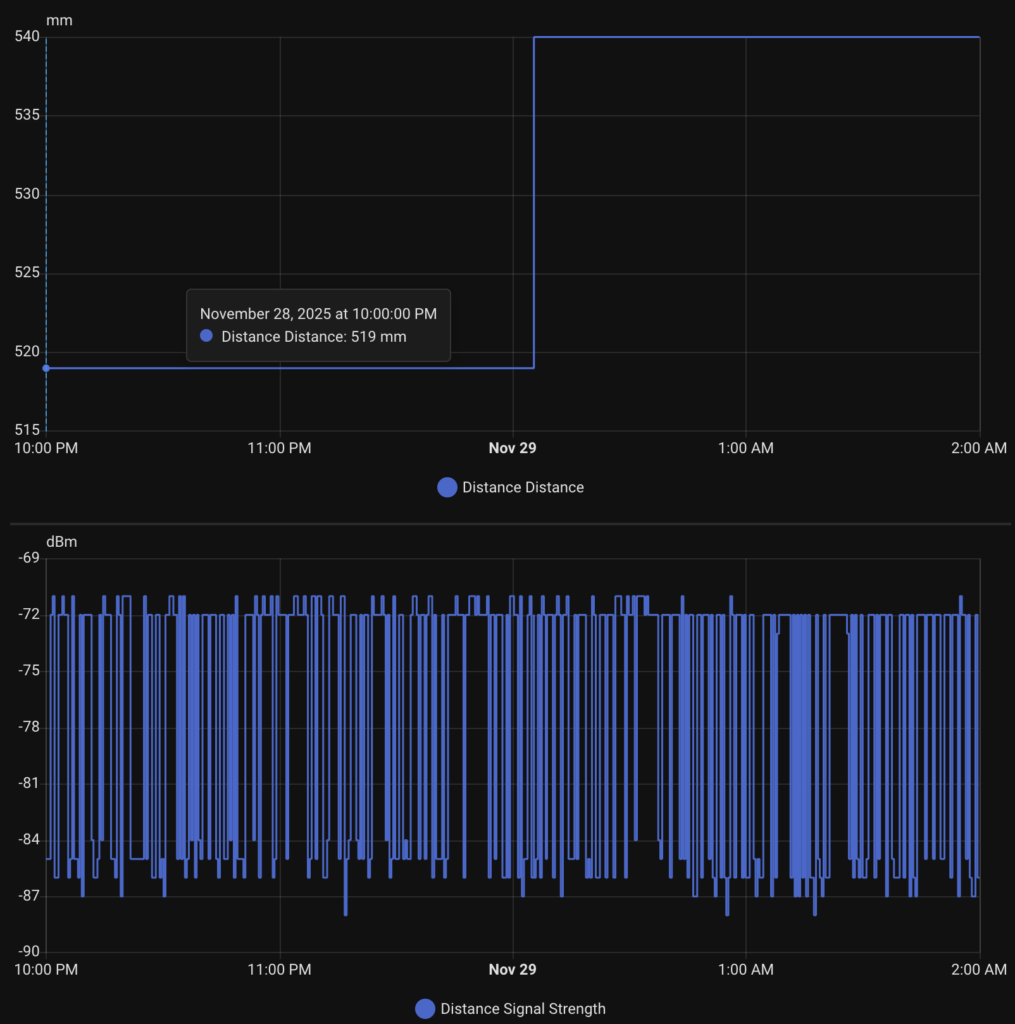
Eventually, the device gave me an update after 4-5 days, it jumped from 519mm to 540mm liquid distance from the device – FINALLY consumption! 4 days later it did it again, 540mm to 561mm. Both times this value change came through just after midnight. Some observations:
Update frequency
While the accuracy documented mentioned accuracy of "+/- 2cm" (though re-reading the document its not very clear!!!), I expected that to mean "the measurement reported will be +/- 2cm". What it seems to actually mean is that "the measurement reported will update only when there is a change at 2cm".
Take a look at my readings again, both times the device only updated when a change in 21mm was realised. In my tank that is around 40L of usage / change in liquid levels (that will change over time as the tank is round, so 20mm isn’t always 40L – it just is where it is right now).
Update timing
As I mentioned, both updates came just after midnight. Interestingly at both of these moments, no oil changes were happening. I have my heating and hot water turned off at night, from 10pm every night. So it took the Shelly just over 2 hours to recognise the liquid level change and report it back.
Again this was not due to connectivity, I can see consistantly good updates every 30 seconds (I am measuring signal strength from the device which is updated all the time). I have no idea why it would take so long to report the change when the oil level is static for so long.
Disappointed.
Frankly, I am disappointed with the device as sold. Yes it is measuring, but the delays, accuracy and timing of the updates just don’t fill me with any confidence about my tank levels – which is REALLY what I need in winter. I hope Shelly can do something with a firmware update to improve these findings. Would love to hear your thoughts and experience – please add comments here.
In my last post I talked about how I installed a Shelly BLU Distance in my heating oil tank to measure how much oil I had left. Everything worked fine, though after a few days there have been no updates to the levels – despite lots of oil being used to heat my house and hot water.
When installing the device parallel to a surface, ensure it is at least 20cm away from the surface (e.g. walls) to prevent inaccurate readings due to wave reflections
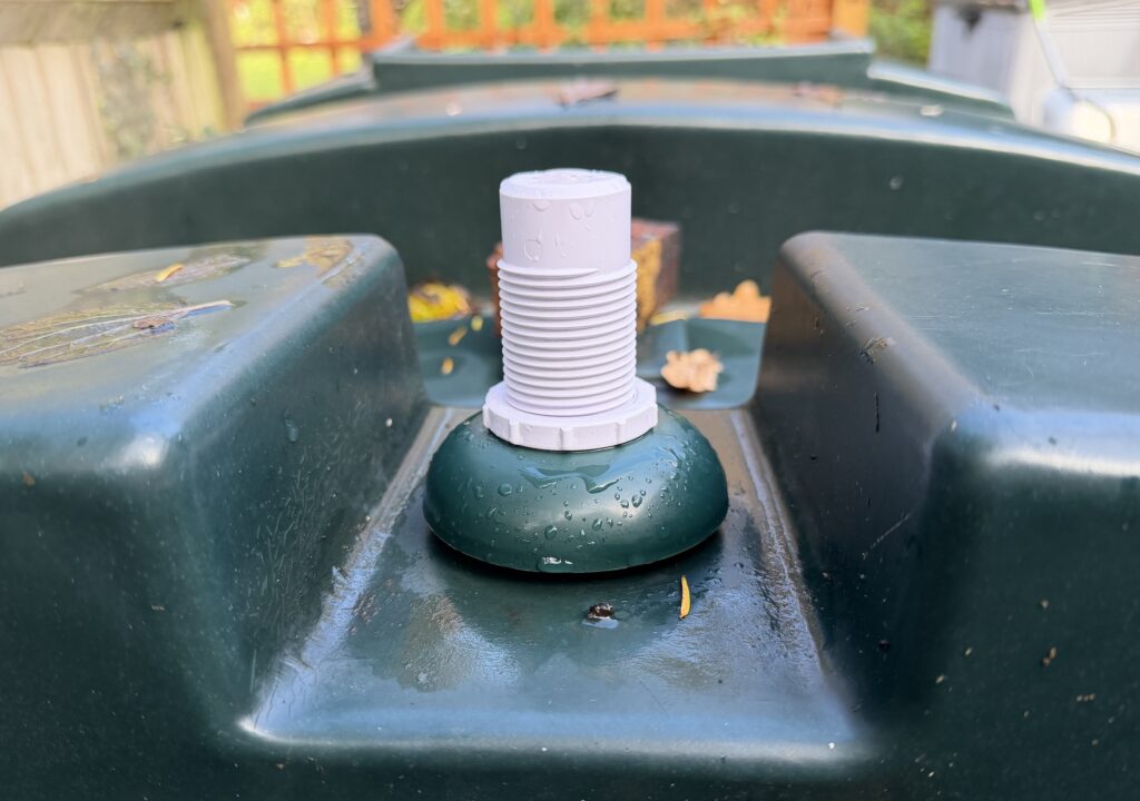
As I showed in my previous post, I had most of the device sticking out of the top of the tank, which meant there was very little inside the tank. Based on my calculations, it looked like only 14mm of the device was actually inside the tank. If the instructions were looking for 20cm clearance around the sensor, I was not doing that as the tank is curved and infringing on that.
The Change
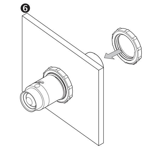
It is an easy fix, have more of the BLU Distance inside the tank, so that there is the 20cm clearance around it. All I did was remove the screwcap that came with the tank, and adjusted the mounting nuts to allow the device to sit lower down.
I was a little apprehensive about this change (a) how it might affect signal strength, (b) how it affects the measurements. The device already has a minimum 200mm measurement which is a significant portion of my tank it cannot read, by putting the device deeper in the tank I can now measure even less of it.
Results
In terms of signal strength, I actually found that the dBm measurement is almost exactly the same as before. This leads me to believe that the BLE aerial in the device is actually closer to the sensor tip than on the other end as I had initially suspected. This is an interesting design choice and might affect those even more with metal tanks. In fact I am seeing slightly better signal strength after going deeper inside the tank a little.
I will update this post with results on the oil measurement frequency and if re-positioning the device actually changed anything for me.
I would love to hear from you and your experiences using the Shelly BLU Distance. Contact me on github
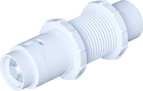
Shelly recently launched the BLU Distance – a bluetooth low energy device that can measure distances up to 5 meters (200mm-5000mm). It can support use cases such as liquid measurement (in a water or oil tank for example), or distances of objects (like in a garage or driveway for your car). It promises long battery life (up to 4 years), as well as detection every 5-30 seconds (configurable) and/or based on vibration detection using a built-in accelerometer. The spec outlines an accuracy of +/- 20mm from 20 cm to 200 cm range, and +/- 2cm above 200 cm: +/- 1%.
This sounded perfect for my use case. I live out in the UK Sussex countryside, out here there is no mains gas so I have a kerosene oil tank. I’ve had an offline sensor in the tank since I moved in, which beams some level of tank volume to a small device plugged in to the wall socket. Unfortunately it recently stopped working so I’m flying blind – but along comes the BLU Distance!
Installation
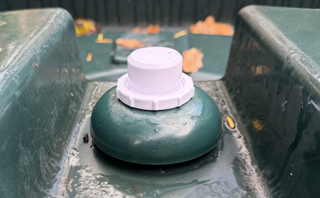
Before you do anything, measure the height of your tank from the lowest point, up to where the Shelly BLU Distance will be installed. In my case that was 1080mm.
Setting up the BLU Distance was pretty straight forwards, but there are a couple of things to look out for as you set things up.
To install on my tank (a Titan H1300TT 1300 litre), I used an existing screw in cap that was on the top of the tank. I grabbed a 36mm hole cutter saw bit from Amazon which is the exact spec from Shelly. Using the drill bit, I carefully drilled the 36mm wide hole into the plastic screw cap.
The BLU Distance comes with a protective plastic shield around the device and two adjustable screw connectors. This enables you to position the device in the hole you just drilled, placing the two screw connectors either side of the hole to make a tight fit.
However, before placing the device in the hole, you need to turn it on and set it up. Take the device out of its protective shield by following the instructions, pull the tab out of the battery compartment to turn it on. Use the Shelly app to add the device to your account, and connect it to a bluetooth gateway (most Shelly products these days include a BLE gateway setting, you might need to turn that on, or purchase a separate Shelly USB BLU gateway). For example, I connected mine to a Shelly Uni device setup in my garage already.
Once connected, go through the setup tutorial in the app – it asks if you are measureing liquid (yes!), and the height of your tank. This helps the Shelly app determine liquid levels and percent full data.
Once complete, screw the device onto the cap, and screw the plastic cap back onto the tank. Within 30 seconds (default setting) you should see a liquid reading in the Shelly app.
Setting up Home Assistant
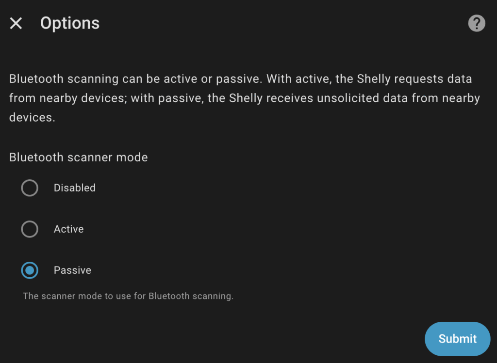
As I mentioned before, you need to setup a bluetooth BLE device for the BLU Distance to talk to. If not already installed, make sure the BTHome integration is installed in home assistant, as well as the Shelly integration. In my case, the Shelly Uni was already installed and connected to Home Assistant. Turning on its BLE setting in the Shelly app is step one, but in order for Home Assistant to get continuous updates, you need to configure the device (this step is important and relevent for all Shelly BLE devices)
Go to the Shelly integration in Home Assistant. The next page shows the list of devices connected to the integration. Scroll to find the BLE gateway you connected the BLU Distance to, and hit the Settings cog icon.
Ensure that "Passive" is set for the "Bluetooth scanner mode". Flip over to the BTHome integration, you should be prompted to install a new device which is the BLU Distance. Once installed you’ll get a "distance" entity in mm, and a "vibration" entity whenever it detects a vibration (on / off).
Quick observations
There’s been talk already of connectivity issues from the BLU Distance to its bluetooth gateway. Mine is connected to a Shelly Uni which is about 2.5 meters away from the device, with a line of sight through a garage window. On average I see a -80 dBm signal strength which isn’t great, however I am consistently seeing updates every 30 seconds. My oil levels dont change that often so no concern for me.
Others have reported no signal at all from their tanks, when installing inside a metal tank. It is very likely the metal tank is interfering with the bluetooth connectivity. In my case, I have made sure that most of the unit is outside of the tank in the hope that the antenna is outside. You can adjust that with the two adjustable screw connectors I mentioned above.
Lastly, I’ve been a little disappointed with the accuracy. Maybe I should have RTFM, despite my oil levels diminishing, the device continues to show a static level of liquid measurement. I believe this is due to the +/- 20mm accuracy, so if the oil drops by 1mm, that simply isn’t registering. I still think this is OK for my usecase, but I was hoping to see a daily shift. I will keep an eye on it.
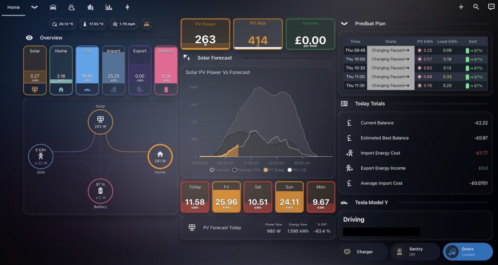
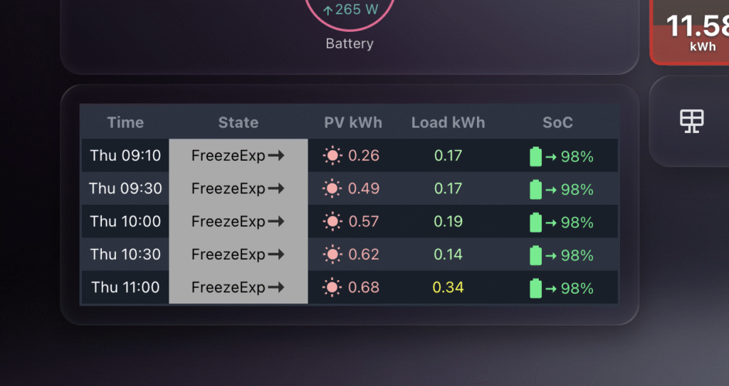
A small tweak to the Predbat Table Card has enabled a really cool new use-case – MINI Predbat table cards!
Github user @stiplady made a request to add a limit to the number of rows the plan returns, for "quick look" style functionality. A pretty easy change, but has unlocked some very cool functionality.
Predbat mini card on a home assistant dashboard
By limiting the number of rows, users can now combine this functionality with custom columns and font size to create a mini Predbat table card on bigger dashboards.
Previous to this, while you could limit the columns, the plan was usually 24 hours long, so at least 48 rows of data – which was not great for dashboards with other cards in place.
Close up of the Predbat Table Card MINI
As you can see in the images above, placing the table card nicely in a dashboard is now super easy!
Here’s the YAML you can use to get started – obviously feel free to customise the YAML to meet your needs according to the spec.
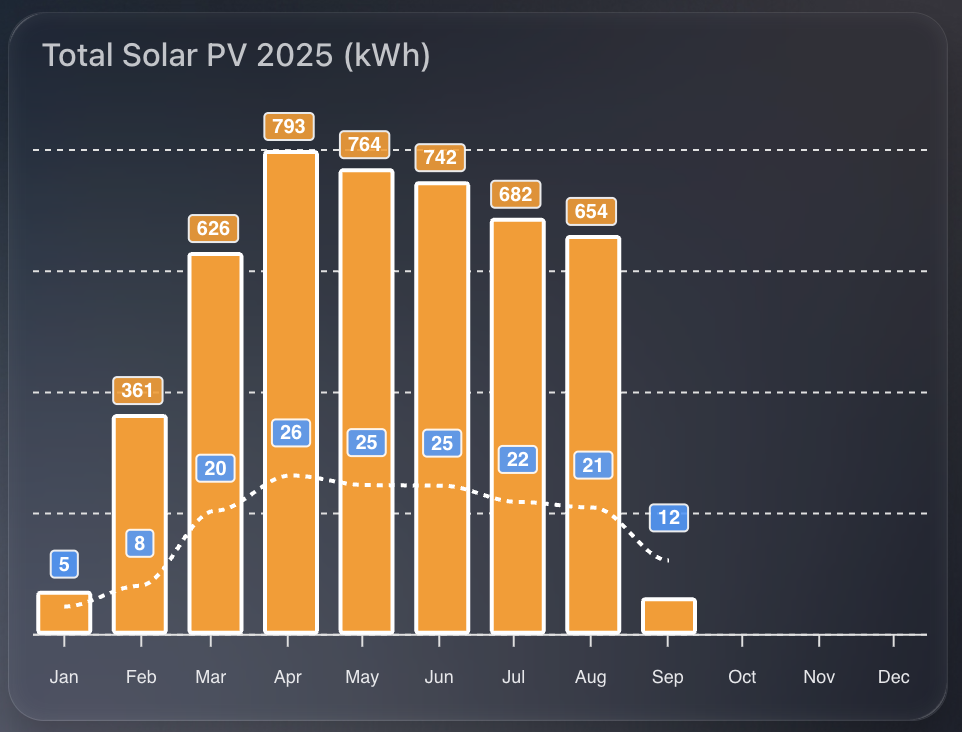
This beautiful apexcharts chart gives me a clean annual view of solar PV performance month on month.
I show two things at once:
Total kWh per month as orange columns.
Average daily PV for that month as a dashed line.
That pairing makes it easy to compare seasonal variation and spot how consistent generation is within each month.
1) The time window
I want a rolling 12-month view, aligned to the current year start, updating every 30 minutes.
graph_span: 12month
update_interval: 30m
span:
  start: year
  offset: "-0d"
2) Monthly totals as columns
I read SolarEdge lifetime energy, convert Wh to kWh, then sum by month. I also enable statistics so ApexCharts aligns changes to month boundaries for accurate month on month totals.
- entity: sensor.solaredge_lifetime_energy
  name: PV Last 12 Months
  color: var(--energy-solar-color)
  type: column
  float_precision: 0
  yaxis_id: first
  transform: return x / 1000;
  show:
    datalabels: true
  group_by:
    func: sum
    duration: 1month
    fill: zero
  statistics:
    type: change
    period: month
    align: end
Why:
transform converts Wh to kWh.
group_by: sum gives a single monthly bar.
statistics: period: month ensures the change is aligned to the end of each month.
3) Average daily PV as a dashed line
I reuse the same entity and conversion, but average across the month, with statistics aligned by day. This produces a smooth “average day in this month” figure.
- entity: sensor.solaredge_lifetime_energy
  name: PV Last 12 Months
  type: line
  stroke_dash: 3
  float_precision: 0
  color: "#3399FF"
  yaxis_id: second
  transform: return x / 1000;
  show:
    datalabels: true
  group_by:
    func: avg
    duration: 1month
    fill: zero
  statistics:
    type: change
    period: day
    align: end
  extend_to: false
Why:
group_by: avg over a month produces the per-month daily average.
statistics: period: day uses daily changes to derive a meaningful daily rate.
stroke_dash: 3 makes the line read as a secondary metric.
4) Dual y-axes for tidy scales
Totals and averages sit on different ranges, so I bind columns to the left axis and the line to the right axis. Both are hidden to keep the design clean.
TADO has introduced strict new API limits that will seriously impact anyone integrating their smart heating system with Home Assistant or other automation platforms.
For years, smart home enthusiasts have relied on TADO’s API for near real-time heating and hot water control. But with the recent changes, users are now restricted to just 100 API calls per day unless they pay for a subscription.
TADO API Limits Explained
TADO has reduced the default polling frequency of their home assistant integration to every 15 minutes, which works out to roughly 100 calls per day (their new API limit). That may sound reasonable at first glance, but in a smart home environment, it’s far from enough.
Automations such as pre-heating rooms, adjusting heating when doors and windows are open, or monitoring hot water require near real-time updates. Waiting up to 15 minutes for an update simply breaks the purpose of automation.
TADO now offers a paid subscription (currently $29.99 per year) to increase limits to 20,000 calls per day. While not expensive in isolation, it feels like a hidden cost on top of the hundreds of pounds many of us have already invested in TADO hardware, and a bit of a rug pull / bait and switch.
Local API Access Through HomeKit
TADO’s official “alternative” is to use local access via HomeKit on V3+ bridges (or Matter on Tado X). But this approach has serious drawbacks:
Requires additional Apple hardware like an Apple TV or HomePod to act as a hub on V3+.
No hot water support. Local access covers TRVs, temperature, and humidity – but not hot water control.
For many households, hot water is just as important as heating. Limiting its control to cloud-only updates every 15 minutes makes the system feel incomplete.
TADO Integration Problems in Home Assistant
Home Assistant users face another major issue: the TADO integration is unstable. Sessions frequently log out at random, breaking automations and leaving users without reliable control.
The integration is community-maintained, not officially developed by TADO, and the company shows little interest in fixing these problems. It leaves power users caught between unreliable cloud access and incomplete local control.
TADO X and Matter Support
TADO’s latest hardware, TADO X, includes Matter support – a promising step towards local integration without needing Apple’s HomeKit ecosystem.
But once again, there’s a catch: no hot water support. And so far, TADO has made no public commitment to add it in future.
For many, this undermines Matter’s potential to finally deliver reliable, subscription-free local access.
Why This Matters for Smart Home Owners
The whole point of a smart heating system is flexibility and integration. TADO’s decision to restrict API access feels like a step backwards:
It penalises the most engaged users who automate beyond TADO’s app.
It introduces unnecessary subscription costs.
It limits functionality by excluding hot water from local integrations.
Rather than blaming users for “overusing” the API, TADO should re-evaluate its infrastructure. A well-designed API can scale. Instead, customers are left with broken integrations, missing features, and a sense that they’re being upsold to fix problems they didn’t create.
Final Thoughts
As someone who has spent over £700 on TADO hardware, I find these changes disappointing. Smart home enthusiasts chose TADO because it promised openness, flexibility, and control. Now, that vision feels compromised.
Until TADO re-thinks its approach, many Home Assistant users may start looking elsewhere for heating solutions that truly embrace the principles of the smart home.
I came across an interesting issue today and thought it worth documenting.
I have setup a template sensor which is triggered by the state change of an entity. This template sensor saves a generic state (a string saying OK), storing a maximum or minimum value of the referenced entity as an attribute. Its a daily maximum, so I reset it at midnight.
Template Sensor Setup
In order to calculate if for example the "new" state of the entity was higher than the previous maximum value stored in the attribute, I have this logic in the template sensor YAML:
attributes:
    max_rain: >
        {% set r_new = states('sensor.tempest_precipitation_intensity') | float(-1) %}
        {% set prev = this.attributes.max_rain | float(-1) %}
        {{ [r_new, prev] | max if trigger.platform != 'time' else r_new }}
So, create a variable r_new of the current state of the precipitation intensity entity, otherwise return -1.
Next, set a variable prev to get the previous value of the current template sensor attribute (max_rain), otherwise return -1.
Finally set the max_rain attribute to the largest of the two variables (r_new or prev), or reset to the current state (r_new) at midnight.
The Problem
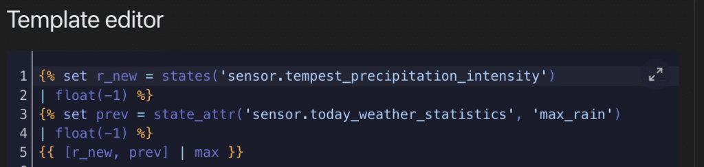
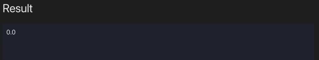
If you test out this YAML logic in the developer tools, it works without error. E.g.
{% set r_new = states('sensor.tempest_precipitation_intensity') | float(-1) %}
{% set prev = state_attr('sensor.today_weather_statistics', 'max_rain') | float(-1) %}
{{ [r_new, prev] | max }}
The result here is 0.0, which reflects the current state from sensor.tempest_precipitation_intensity. In this case prev is returning -1 because the attribute max_rain does not exist on sensor.today_weather_statistics. All expected so far.
The REAL problem
The issue comes in when we’re trying to create this template sensor for the first time and establish the max_rain attribute. Because the logic to create and update the max_rain attribute references itself, something internally seems to fail. This all happens despite the YAML being safe in the developer tools. E.g.
{% set prev = state_attr('sensor.today_weather_statistics', 'max_rain') | float(-1) %}
Returns -1 safely in the developer tools. But it seems this kind of reference to itself cannot work on the first initialisation of the attribute itself. What you’ll find is the attribute never appears in your template sensor.
Solution
So instead of creating the self referencing logic in the first place, the easiest thing to do is something like this, where you create the attribute and assign a default value:
Restart Home Assistant, go check out your new sensor, and confirm the max_rain attribute appears, with a value of 0.0.
Now you’re ready for the self-referencing logic to work and not fail. Go back to your template sensor YAML, and update the max_rain logic:
- trigger:
  - platform: state
    entity_id:
        - sensor.tempest_precipitation_intensity
  - platform: time
    at: "00:00:00"
  sensor:
    - name: 'Today Weather Statistics'
      unique_id: today_weather_statistics
      state: "OK"
      attributes:
        max_rain: >
                    {% set r_new = states('sensor.tempest_precipitation_intensity') | float(-1) %}
                    {% set prev = this.attributes.max_rain | float(-1) %}
                    {{ [r_new, prev] | max if trigger.platform != 'time' else r_new }}
Restart Home Assistant – this time you should still see your attribute, but most importantly, see the value increase from 0.0, should the state of your reference entity be higher.
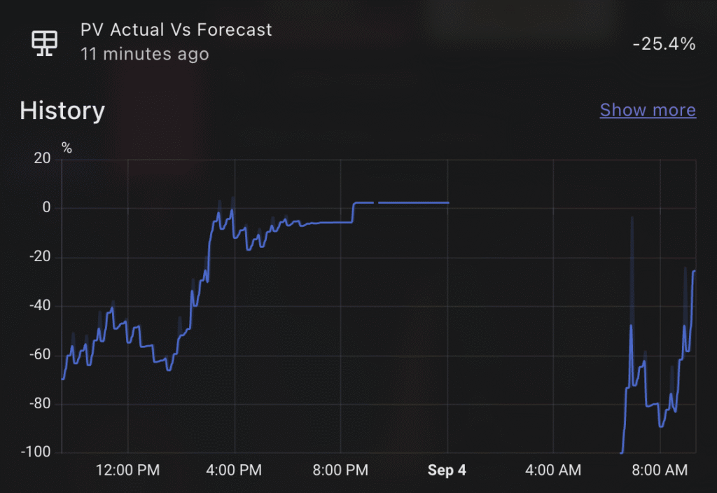
One of the most powerful aspects of Home Assistant is being able to stitch together data from multiple sources to create meaningful insights. In this post, I’ll walk through how I created a sensor that compares the predicted solar generation against the actual solar energy generated by my system, giving me a live percentage difference throughout the day.
This is particularly useful to understand how accurate your solar predictions are, and whether your solar generation is outperforming (or underperforming) expectations as the day progresses.
Why this sensor?
I use Predbat to manage my solar battery charging and discharging logic. One of its inputs is a daily solar PV forecast, which it sources from Solcast (if configured).
While my GivEnergy inverter provides solar generation figures, I’ve found that the SolarEdge integration (via my SolarEdge export meter) provides more accurate daily totals. You can install a SolarEdge integration through Home Assistant if you have this setup. So for this comparison, I use:
Predbat’s detailedForecast attribute from sensor.predbat_pv_today for the expected PV generation in 30 minute slots
SolarEdge’s sensor.solaredge_energy_today as the actual generated PV value
How it works
The custom template sensor does the following:
Iterates over each 30-minute slot in the Predbat detailedForecast.
Sums up all past PV forecasts (based on current time) to create a "so-far" forecast.
Compares that to the actual solar generated today from SolarEdge.
Calculates the percentage difference, showing how far above or below the forecast we are right now.
This is a dynamic sensor, updating as time passes and more of the forecast becomes "in the past."
What it tells me
The resulting percentage gives me a clear sense of solar performance in real time. For example:
If the value is positive, I’m generating more than expected.
If it’s negative, I’m falling behind the forecast.
This can help explain battery decisions, why Predbat may or may not be dispatching energy, and offer insight into Solcast’s accuracy over time. I tend to find, due to the nature of the solarEdge updates, that the PV predicted is always higher than what I have achieved, but slowly throughout the day it catches up. Sometimes I get lucky and outperform the PV prediction!
Predbat’s DetailedForecast attribute
Within the PV prediction entity for today, Predbat provides a DetailedForecast attribute, which is a 30 minute breakdown. My sensor is based on pv_estimate, but you can choose whichever you want, just update the YAML accordingly.
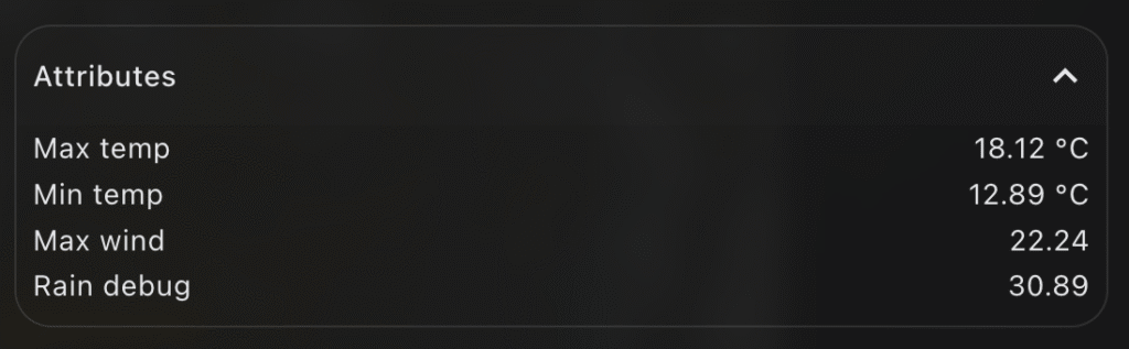
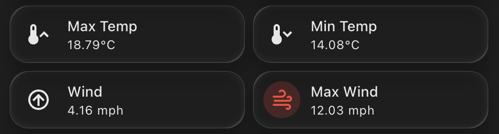
Tracking daily weather extremes in Home Assistant can be a really useful addition to your dashboard, especially if you’re keen to understand trends over time or highlight key information visually.
In my case, I wanted a lightweight, efficient way to display the maximum temperature, minimum temperature, and maximum wind speed recorded during the day. Not only does this create a simple historical snapshot, but it also enables me to power Mushroom Template Cards with rich attribute data, without needing to rely on external integrations or long-term statistics.
The Template Sensor
Here’s the YAML I used to create a template sensor that records today’s key weather stats. This sensor uses a combination of state and time-based triggers to reset at midnight and accumulate data throughout the day.
- trigger:
    - platform: state
      entity_id:
        - sensor.tempest_temperature
        - sensor.tempest_wind_speed
    - platform: time
      at: "00:00:00"
  sensor:
    - name: 'Today Weather Statistics'
      unique_id: today_weather_statistics
      state: "OK"
      attributes:
        max_temp: >
          {% set t_new = states('sensor.tempest_temperature') | float(-99) %}
          {% set prev = this.attributes.max_temp | float(-99) %}
          {{ [t_new, prev] | max if trigger.platform != 'time' else t_new }}
        min_temp: >
          {% set t_new = states('sensor.tempest_temperature') | float(99) %}
          {% set prev = this.attributes.min_temp | float(99) %}
          {{ [t_new, prev] | min if trigger.platform != 'time' else t_new }}
        max_wind: >
          {% set w_new = states('sensor.tempest_wind_speed') | float(-1) %}
          {% set prev = this.attributes.max_wind | float(-1) %}
          {{ [w_new, prev] | max if trigger.platform != 'time' else w_new }}
How it works
State triggers respond to changes in sensor.tempest_temperature and sensor.tempest_wind_speed. Every time they update, the template checks if the new value exceeds (or undercuts) the previous attribute value and stores the result.
Midnight reset is achieved via a time-based trigger at 00:00:00. At this point, the values reset to the current readings (effectively seeding the day).
The state is set to "OK" as a placeholder—it’s not used for charting or display, but helps avoid null states.
Home Assistant issues with adding new attributes
I found (randomly it seems not predictably) that some of the new attributes would not be created on their first load, once I restarted Home Assistant. It was very frustrating to debug, the logic is to set a variable from a entity state, or otherwise set a float – but something is failing. If you too are finding that the attribute isnt appearing, instead – establish the attribute more simply with a default value. Restart HA and confirm the attribute now shows up. E.g.
        max_wind: >
          {{ float(0) }}
This creates the new max_wind attribute with a default value of 0.0. Now update your YAML per the above with the logic to capture the maximum wind speed, this time it should update without issue.
Using This Sensor in Mushroom Cards
Now that the max and min values are stored in the attributes, you can easily access them in mushroom-template-card components. Here’s an example that shows the max temperature for today: